Preview Packaging with Your Logo
Enam ide desain kemasan, dari grafis yang berani hingga elegan klasik, semuanya dibangun dari logo yang sama. Unggah logo Anda, pilih industri dan gaya, dan lihat satu set kemasan bermerek lengkap dalam satu gambar.
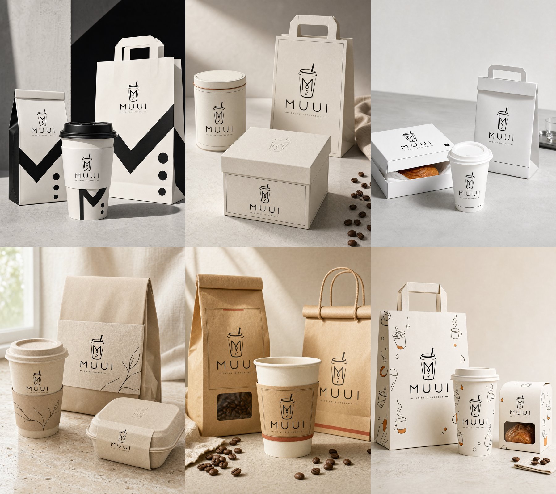
Most packaging inspiration shows someone else’s brand. That helps you pick a mood, but it doesn’t tell you how milikmu logo will look on a cup, a bag and a box. So we kept everything the same (one logo, one industry, one three-piece set) and changed only the style. Look at the six results side by side and the difference isn’t just color. The paper, the shapes, the finishes and the setting all change.
The logo we started with
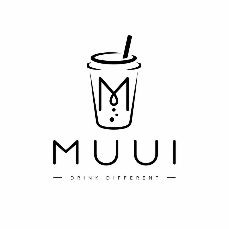
MUUI is a demo drinks brand: a thin-line cup with an M and three bubbles, a wide wordmark and a small tagline. It’s black only, with no brand color. That makes it a fair test, because every style has to build its look around the mark rather than lean on a ready-made palette.
Every image below used this file, the Coffee shop industry and the Essentials set of three core packaging pieces.
Pick a direction by what your brand needs to say
| Your brand wants to feel… | Mulailah dengan | Look closely at |
|---|---|---|
| Loud and easy to spot | Bold graphic | Big shapes that still leave the logo whole |
| Refined and gift-worthy | Classic elegant | Rigid boxes, fine lines, blind embossing |
| Precise and uncluttered | Minimal modern | Clean edges and how much white space the logo gets |
| Calm and close to the ingredient | Natural organic | Fiber textures and molded shapes |
| Warm and crafted | Natural vintage | Kraft paper, folded tops, rope handles |
| Friendly and fun | Playful illustration | One drawing style across every piece |
Not sure? Choose Match my brand. It reads your logo, colors and industry and commits to one of the six directions instead of blending them.
Six packaging design ideas, one logo
1. Bold graphic
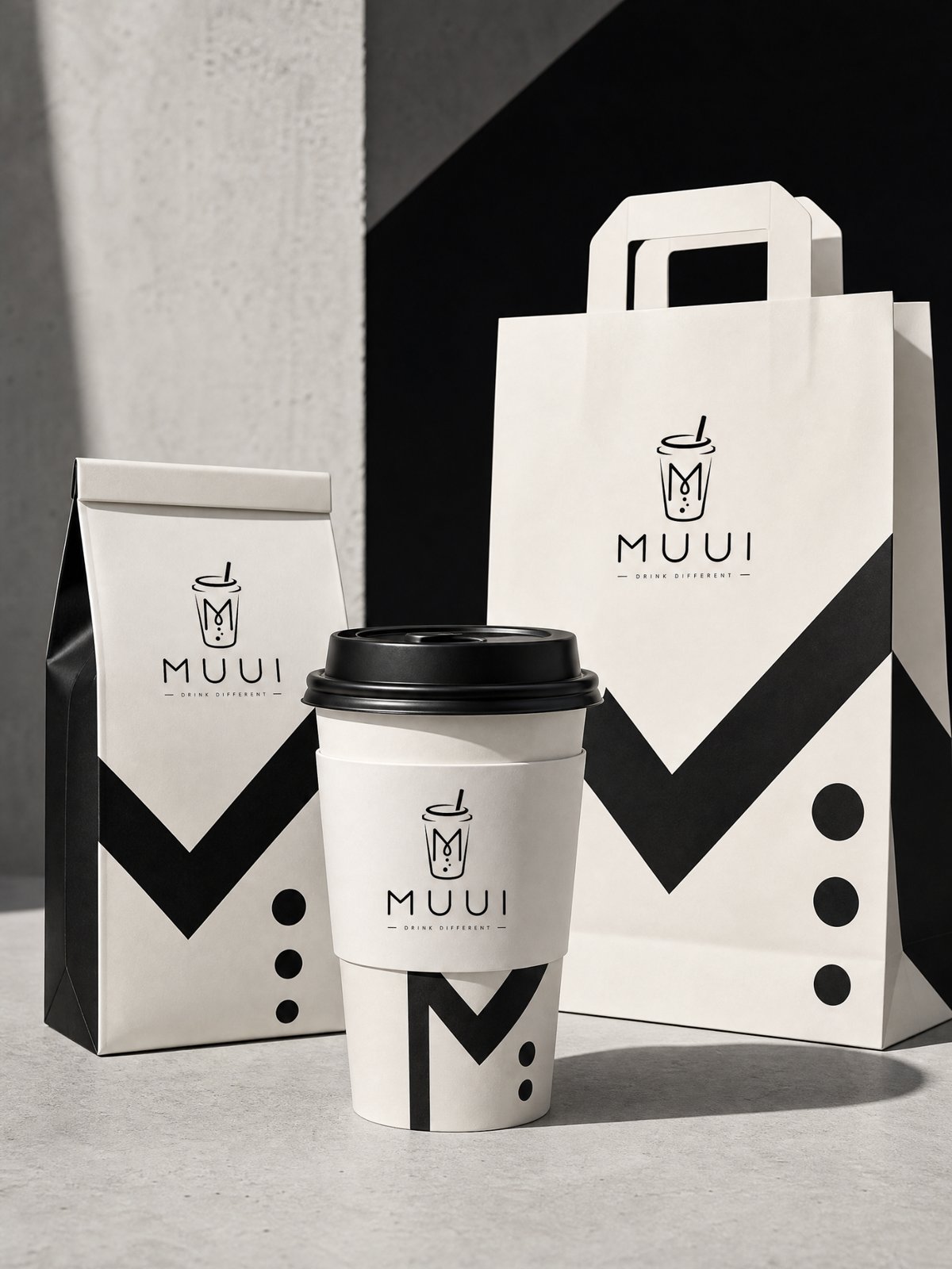
Oversized shapes printed in solid color across a coffee bag, a sleeved cup with a black lid and a flat-handle carrier bag. The interesting part is where those shapes come from: the zigzag is the M from the logo, and the dots are its bubbles, blown up to fill the surface. The logo itself stays small and intact on top. The staging matches: a hard black-and-white backdrop and strong shadows.
Good for: takeaway, snacks and drinks that need to stand out on a counter or in a feed. Check: that the graphics stretch the brand, not the logo.
2. Classic elegant
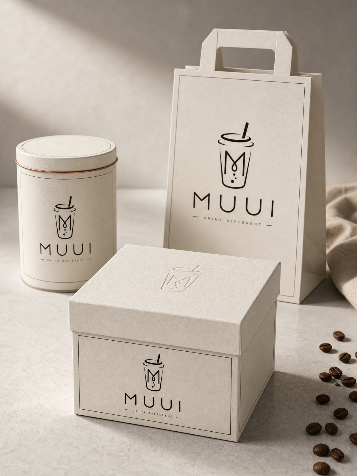
A rigid lid-and-base box, a metal tin with a thin copper line and a carrier bag, all in warm off-white. Each piece gets a fine printed frame, and the gift box lid has the logo blind-embossed, pressed into the board with no ink. The result feels expensive without gold foil or mirror gloss. It’s staged on pale stone with soft side light.
Good for: gift sets, premium tea, coffee beans sold as a present. Check: the preview never adds crests or “since” dates; add heritage details only if they’re real.
3. Minimal modern
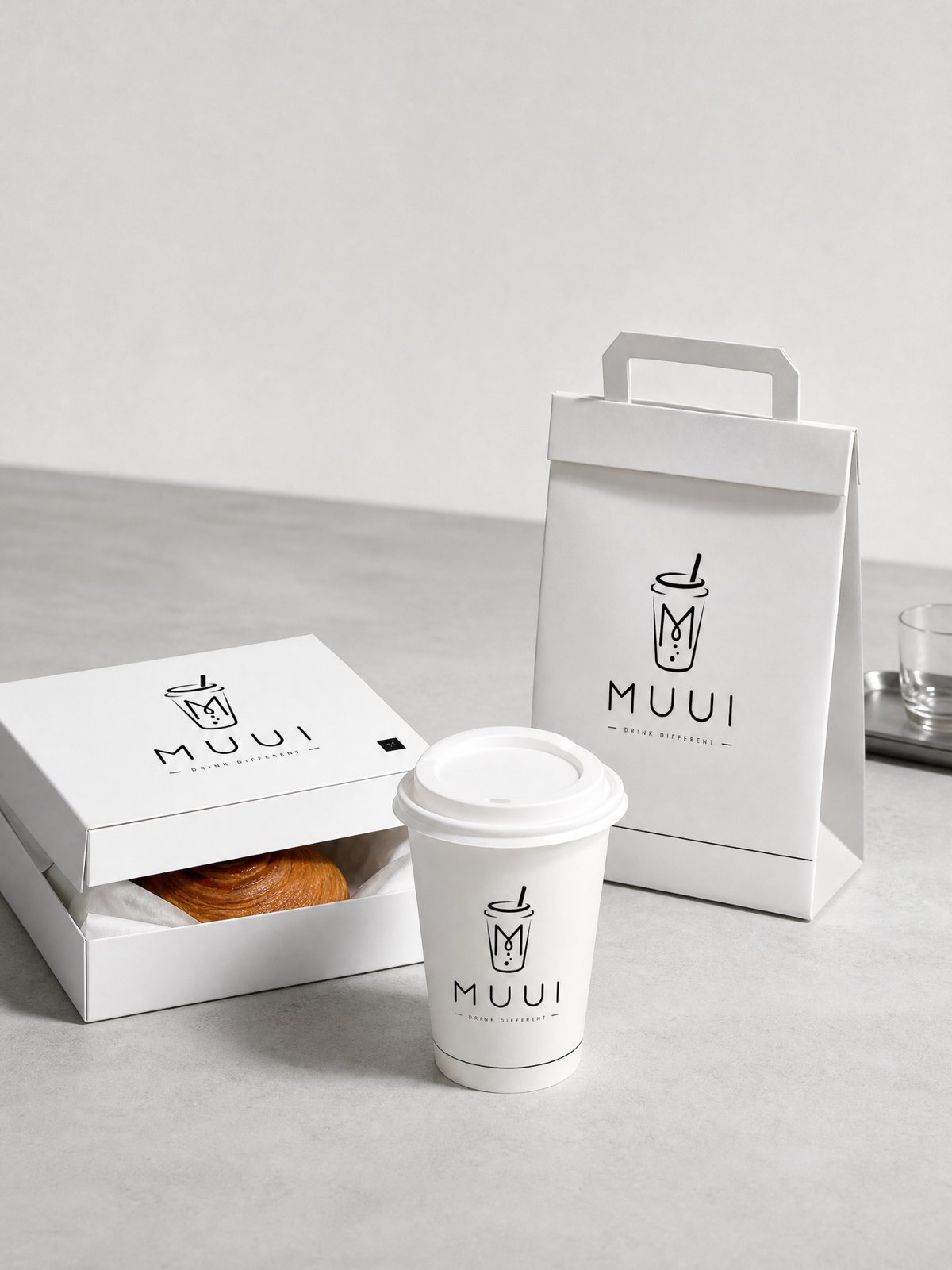
A white pastry box, a lidded cup and a folded bag with a flat handle. Smooth coated board, straight edges and plenty of empty space, staged on light gray under clear studio light. It also added one small extra: a tiny black square mark in the corner of the box lid, used as a secondary brand detail.
Good for: specialty coffee, bakeries with a modern look, lifestyle brands. Check: a thin, light logo can look faint on white; ask for a larger mark if it disappears in a thumbnail.
4. Natural organic
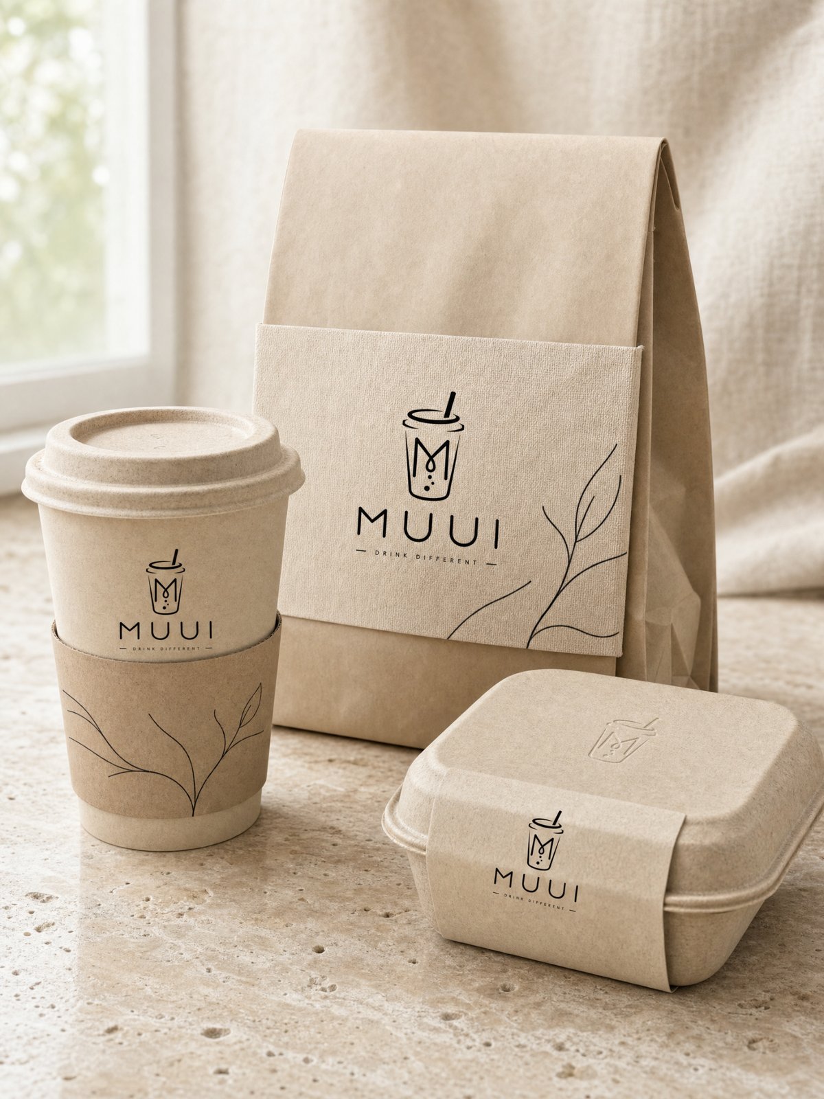
A fiber-textured cup with a sleeve, a folded paper bag held by a wrapping band and a molded-fiber food box with the logo pressed into the lid. A thin line-drawn leaf runs across the sleeve and the band. It’s all set on travertine with soft daylight. Texture does the work that color does in the other styles.
Good for: tea, light meals, wellness and botanical brands. Check: the preview doesn’t add “compostable” or “recycled” claims. Add those to real packaging only if they’re true.
5. Natural vintage
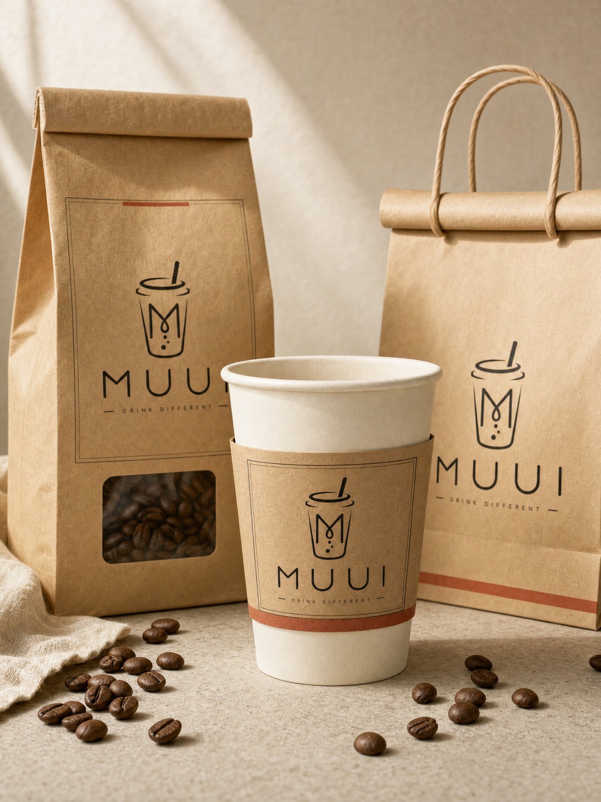
A kraft coffee bag with a window onto the beans, a cup with a kraft sleeve, and a rolled-top kraft bag with twisted-paper handles. A thin rust-red stripe and simple printed frames tie the three together. Warm side light falls across a stone tabletop with linen and scattered beans. It feels crafted without looking dirty or aged.
Good for: neighborhood cafés, roasters, bakeries. Check: it should look freshly printed, not distressed.
6. Playful illustration
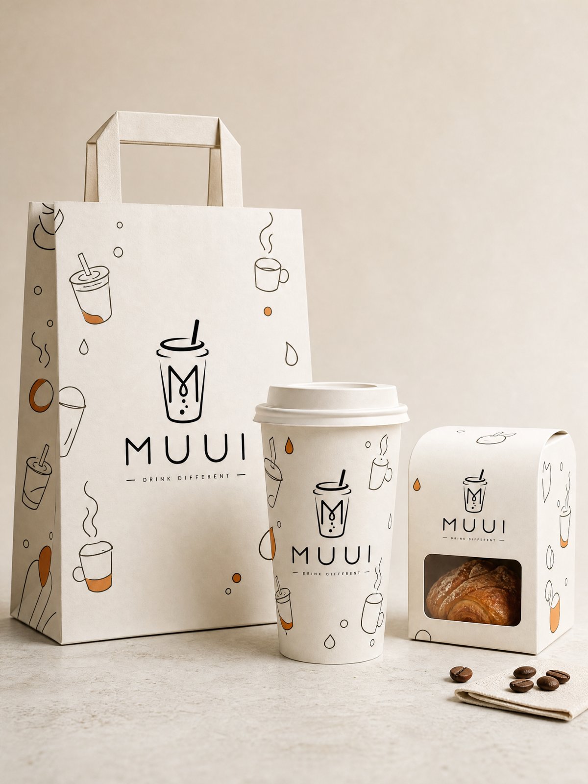
Small line drawings of cups, mugs and drops cover a carrier bag, a cup and a windowed pastry box with a rounded top. Every piece uses the same thin-line style as the logo, so it reads as one family. One thing to know: it introduced an orange accent that isn’t in the original black logo. If you need to stay strictly on-brand, list your exact colors in the notes field.
Good for: bakeries, dessert shops, kids’ and gift brands. Check: a different drawing style on each item is the first sign a set isn’t working as a system.
How it works: from one logo to a full set
- Upload the logo you already have. The mark, wordmark, spelling and proportions are kept as they are. In all six results above, the MUUI cup, the M, the bubbles and the tagline came through intact.
- Choose an industry and a packaging set. Options are coffee shop, tea and tea drinks, bakery and desserts, light meals and takeaway, and fragrance and lifestyle gifts. Essentials shows three core pieces for that industry; Full set shows four to five.
- Pick a style, or Match my brand. Use the notes field for brand colors, a specific item or exact copy.
You get one finished 3:4 image with the whole set in a single photographed scene, ready for a pitch deck or a client review.
Preview Packaging with Your Logo
Don’t have a final logo yet? Start with our guide to writing a logo design brief and comparing three directions. Once the packaging is settled, you can turn a product photo into a full set of ecommerce ad images.
Essentials or full set?
Gunakan Essentials while you’re choosing a direction. Three pieces are enough to see whether a style fits, and you can compare several styles quickly, as we did above. Switch to Full set once you’ve picked one and want to see how far the system stretches across four or five items. Need a specific mix, like only a cup sleeve and a takeaway bag? Choose Kebiasaan and list the items.
Pertanyaan yang sering diajukan
Will it change my logo?
No. The logo is used as uploaded. The style changes the materials, shapes, supporting graphics and setting around it.
Will it stick to my brand colors?
It keeps the logo’s own colors. Some styles add a supporting color, as the playful illustration set did with orange. If your palette is fixed, write the exact colors in the notes field.
Does it add text to the packaging?
Only text you give it. It won’t invent ingredients, certifications, dates or claims, so the small print stays empty unless you supply the real details.
Can I get print-ready files?
No. These are concept images for choosing and presenting a direction. Dielines, final artwork and print files still come from your designer and printer.
Can I change one item afterwards?
Yes. Ask for a change to one piece, such as a bigger logo on the bag, and the rest of the set keeps the same style.
Start with the logo you already have
Pick two or three styles from the list and run your own logo through each. Seeing your mark on a cup, a bag and a box makes the decision much easier than scrolling through other brands’ packaging.
Preview Packaging with Your Logo
Tentang Penulis