実際のワークフローで古いAI画像ツールを試したことがあるなら、そのパターンは既にご存知でしょう。最初の結果は印象的です。2番目の結果はまあまあ使えます。その後、テキストが壊れていたり、レイアウトがおかしかったり、編集によって残しておきたかった画像の半分が変わってしまったりしていることに気づきます。まさにこれが、多くのチームが突然注目し始めた理由です。 GPT Image 2 のユースケース.
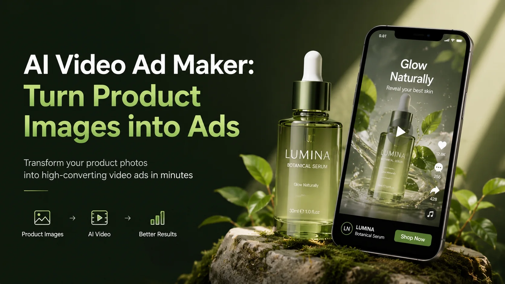
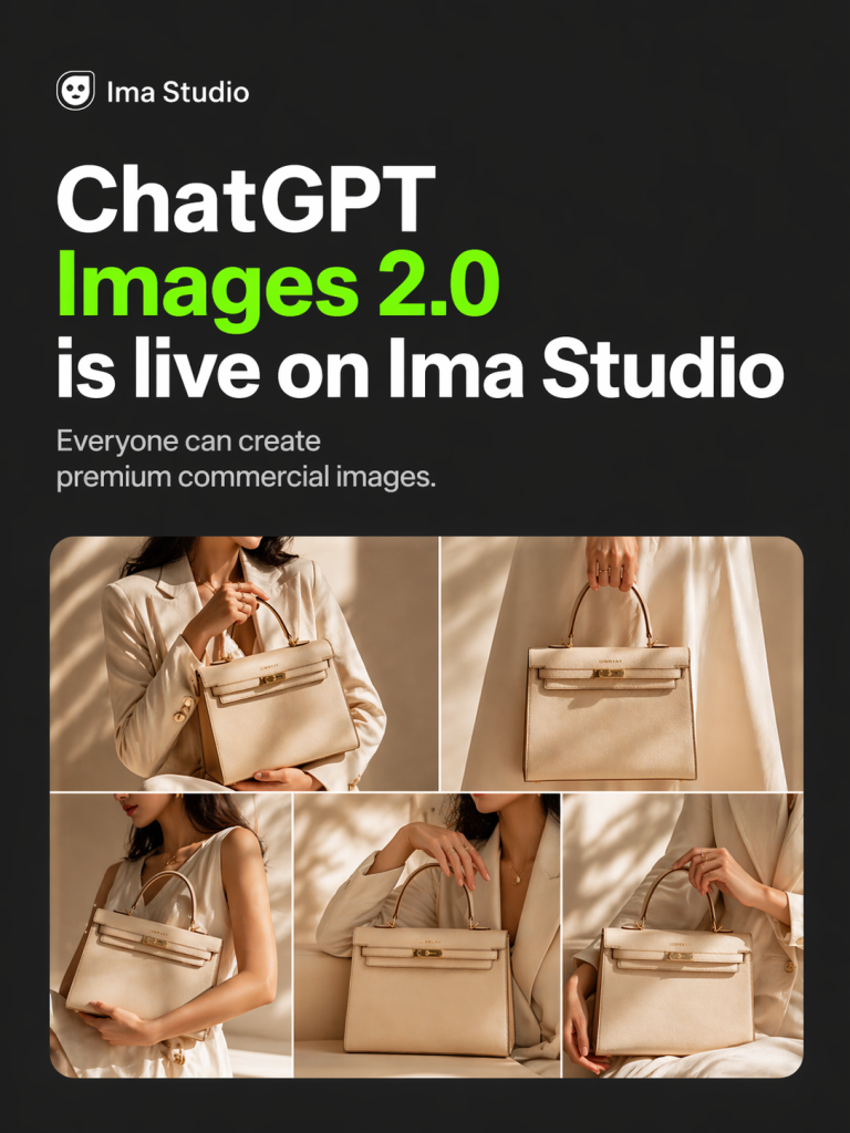
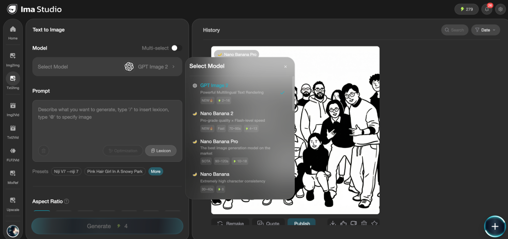
下記のIma Studioのプロモーションポスターは、画像2を使用してワンクリックで生成されました。.
GPT Image 2が興味深いのは、単に美しい画像を生成できるからというだけではありません。そのようなことは多くのモデルで可能です。より重要な変化は、企業が実際に時間と費用を費やす分野、つまり広告クリエイティブ、製品モックアップ、ソーシャルメディア用グラフィック、インフォグラフィック、UI画面、既存のブランド資産への精密な編集といった分野で活用され始めている点です。.
簡単に言うと、GPT Image 2はインスピレーションを得るためのおもちゃというより、実用的な制作アシスタントに近いと言えるでしょう。画像へのテキスト挿入タスクに優れ、詳細な指示に従う能力が高く、見た目のカッコよさだけでなく、ビジネス目的に合った画像が必要な場合に、より信頼できるツールとなります。.
この記事では、ランダムなプロンプトを列挙するのではなく、 GPT Image 2の最適なユースケース これは、マーケティング担当者、eコマースチーム、デザイナー、コンテンツチーム、そして製品担当者にとって実際に役立つ内容です。また、具体的な例も盛り込むことで、各セクションが理論的な内容ではなく、実際のチームが今週からでも試せるような内容になるようにします。.
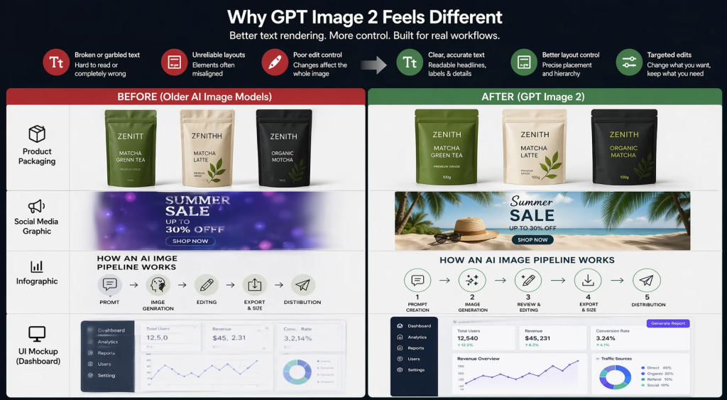
GPT Image 2が従来の画像モデルと異なると感じる理由
最大の理由は単純明快です。それはテキストです。長い間、AI画像ツールは、ファンタジーアート、ムードボード、あるいは大まかなビジュアルアイデアを作成する場合には十分でした。しかし、読みやすいコピーが入った製品パッケージ、実際の見出しが付いたソーシャルメディア用グラフィック、あるいは正確なラベルが必須となるインフォグラフィックを依頼した途端、状況は一変しました。.
GPT Image 2 は完璧ではありませんが、実務作業で重要な分野では明らかに優れています。OpenAI のプロンプトガイダンスとより広範な市場のコメントに基づくと、このモデルは特に次の点で優れています。 テキストを多用した画像、フォトリアリズム、ブランドイメージに配慮した編集、インフォグラフィック、UIモックアップ、高精度なクリエイティブワークフロー. これは非常に重要なことです。なぜなら、それらはまさに従来のモデルが最も多くの不満を生み出していたタスクだからです。.
このモデルが重要なもう一つの理由は、制御が容易であることです。より具体的に何を求めているかを指定できます。例えば、「商品広告を作成してください」と言う代わりに、プラットフォーム、レイアウト、CTAの配置、照明、雰囲気、ブランドカラー、さらには元の画像のどの部分を変更しないかまで指定できます。ワークフローの精度が求められるほど、この制御の重要性は高まります。.
これを理解するのに役立つ考え方はこうです。古いモデルはインスピレーションを得るのに最適でしたが、GPT Image 2 は ワークフロー完了. そのため、GPT Image 2の最適なユースケースは、通常、単発の実験ではなく、繰り返し実施できるチームタスクに関連付けられています。.
1. 製品パッケージのモックアップ
パッケージングは、GPT Image 2が時間短縮にどれほど役立つかを示す最も分かりやすい例の一つです。通常のワークフローでは、チームが新しい飲料、サプリメント、またはスキンケア製品の3つのパッケージデザイン案をテストする場合、通常はデザイナーが各案をレイアウトし、3Dボックスやボトルにモックアップを作成し、フィードバックを受けてコピーを修正する必要があります。これは、特に製品がまだコンセプト段階にある場合、コストがかかり時間もかかります。.
GPT Image 2を使えば、プロセスが格段に速くなります。パッケージの種類、ブランドスタイル、色、トーン、主要なテキスト要素などを指定するだけで、フォトリアルなモックアップを作成できます。このツールの真価は、ラベルのテキストが従来のモデルよりも読みやすく、適切な位置に配置される可能性が格段に高まる点にあります。.
シナリオ例: スタートアップ企業が新しい抹茶製品を検証している場面を想像してみてください。本格的なデザインラウンドを待つ代わりに、創業者は3種類のパウチデザインを依頼できます。ミニマルなデザイン、プレミアムなライフスタイルをイメージしたデザイン、そして大胆なDTC(消費者直販)スタイルのデザインです。それぞれのデザインには、製品名、簡単なメリットの説明、そして重量表示を含めることができます。これだけで、社内レビュー、投資家向け資料、あるいはランディングページの初期テストにも十分対応できます。.
このユースケースが有効な理由: パッケージデザインは、ブランディング、製品イメージ、そしてテキストの正確性という3つの要素が交わる重要な局面です。テキストが間違っていれば、モックアップは役に立ちません。照明や素材が不自然に見えると、コンセプト全体が弱く感じられます。GPT Image 2は、これらの両方の点で優れた性能を発揮し、真に役立つワークフローを実現します。.
2. ECサイトの商品写真と商品バリエーション
ECサイトを運営している方なら、規模が大きくなるにつれて画像制作費がいかに高額になるか、既にご存知でしょう。必要なのは、メインとなる商品写真だけではありません。白背景に商品を写した清潔感のある写真、季節ごとのビジュアル、ライフスタイルシーン、モバイル端末向けにトリミングした画像、マーケットプレイスのサムネイル、そして場合によっては同じ商品の複数のカラーバリエーションなど、様々な画像が必要になります。あらゆる組み合わせでスタジオ撮影を行うと、あっという間に費用がかさんでしまいます。.
これは最も強力なものの1つです GPT Image 2のeコマースにおけるユースケース. このモデルを使えば、チームは参考画像から始めて、すべてを撮り直すことなく新しいビジュアルコンテキストを生成できます。つまり、セラミックマグを清潔な白い背景、温かみのある木製のキッチンカウンター、居心地の良いライフスタイルのセットアップでテストすることができ、3つの異なる写真撮影を企画する必要はありません。.
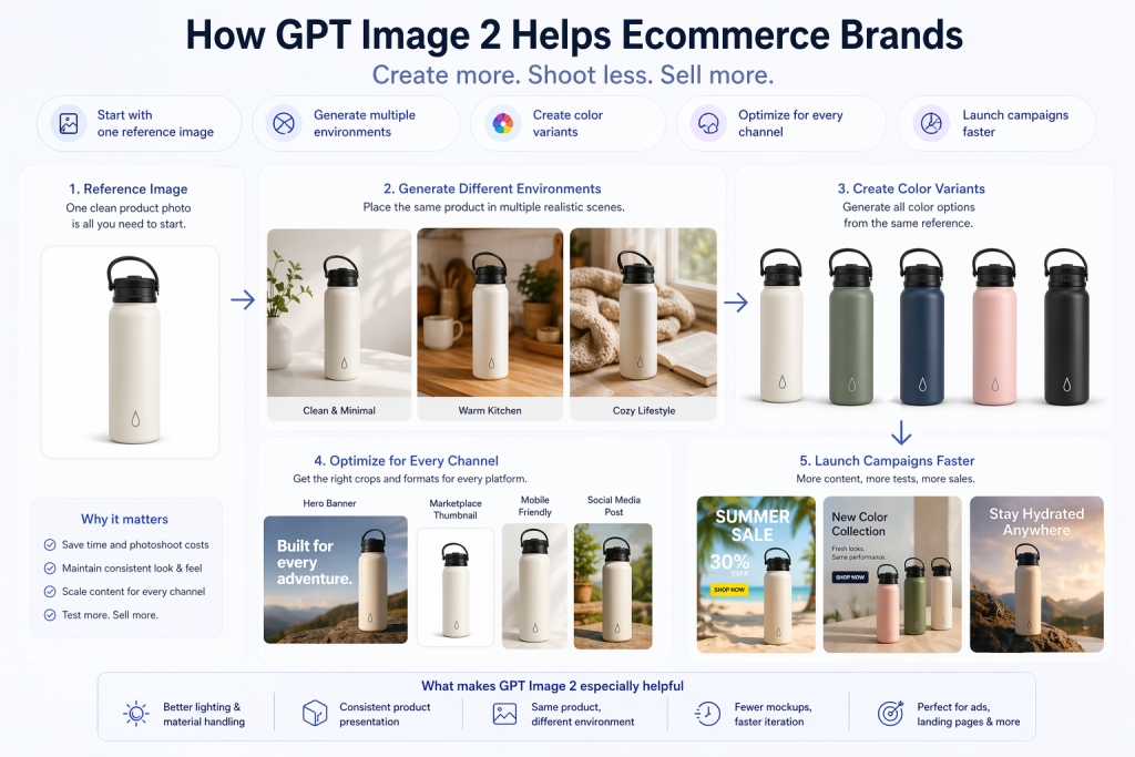
シナリオ例: 同じウォーターボトルを5色展開しているShopifyストアを想像してみてください。5色すべてを複数の環境で撮影する代わりに、チームは強力な参考画像を1枚使用し、ランディングページ、広告セット、季節キャンペーンなど、さまざまな用途に合わせてバリエーション画像を生成できます。これは、プロモーションを迅速に展開する必要がある場合に特に役立ちます。.
GPT Image 2がここで特に役立つ理由は次のとおりです。 照明、素材、製品プレゼンテーションの処理において、従来の多くのツールよりも高い信頼性を誇り、「同じ製品でも環境が異なる」ワークフローにも有効です。つまり、手作業によるモックアップ作成の手間が減り、実験を迅速に行えるようになります。.
3. 各市場向けにローカライズされたマーケティングクリエイティブ
これは最も過小評価されているユースケースの1つです。多くのチームが苦労しているのは、良い広告を1つ作れないからではありません。彼らが苦労しているのは、 20種類のわずかに異なるバージョン 同じ広告を、異なる言語、地域、チャネル、フォーマットで配信する。.
GPT Image 2 が非常に興味深いのはまさにこの点です。マイクロソフトの Foundry チームは、このようなシナリオを直接的に指摘しています。グローバルキャンペーンを実施する小規模なデザインチームは、クリエイティブなビジョンは持っているものの、各市場向けにすべてを同時に再撮影、サイズ変更、レイアウト変更、ローカライズするためのリソースが不足していることが多いのです。GPT Image 2 は、こうした状況をより現実的なものにしてくれます。.
シナリオ例: グローバルSaaS企業が、米国、ブラジル、日本、ドイツで同じプロモーションを実施したいと考えています。コアとなるオファーは同じですが、テキスト、ビジュアルの強調点、場合によっては文化的背景までも調整する必要があります。各アセットをゼロから作り直す代わりに、チームはキャンペーンの雰囲気を維持しつつ、コピーとレイアウトを調整したローカライズ版を作成できます。.
これが重要な理由: ローカライズ処理は通常、隠れた設計上の負債を生み出します。領域が増えるごとに作業負荷は増大します。GPT Image 2がそのコストをたとえ部分的にでも削減できれば、非常に迅速に価値を発揮します。.
4. 有料ソーシャルメディア向けのUGCスタイルの広告クリエイティブ
パフォーマンスマーケティング担当者は常にテスト量の増加を求めている。しかし、新しいクリエイティブを十分な速さで制作するのは難しい。洗練されたスタジオ制作の広告が必ずしも成功するとは限らず、クリエイターによるコンテンツ制作には、素材の調達、ブリーフィング、編集に時間がかかる。そのため、チームはクリエイティブのバリエーションを増やす必要があると認識しながらも、それを十分な速さで制作できないという、中途半端な状況に陥りがちだ。.
これが、UGCスタイルの画像がGPT Image 2の最適な活用事例の一つである理由です。このモデルは、カジュアルな雰囲気の商品写真、ネイティブ風のソーシャルビジュアル、証言スタイルの静止画など、ユーザーがフィードで既に目にしているものに近い広告コンセプトを生成できます。.
シナリオ例: あるDTCスキンケアブランドは、改善前後の写真、日常的なスキンケアアイテムを並べたライフスタイル画像、そしてテキストオーバーレイ付きのユーザーレビュー風広告という3つのアプローチをテストしたいと考えています。本格的な動画コンテンツを制作する前に、チームはGPT Image 2を使用して複数の静止画コンセプトを生成し、どのアプローチをより積極的に展開すべきかを特定することができます。.
重要な注意事項: これは、実際のクリエイターや本物の顧客コンテンツに取って代わるものではありません。しかし、迅速なコンセプト開発、クリエイティブディレクション、初期段階のテストには非常に優れています。.
5. 実際に読みやすいテキストを含むソーシャルグラフィック
これは単純に聞こえるかもしれませんが、実際には大きな課題です。ソーシャルメディアチームは、引用カード、ローンチ画像、カルーセルカバー、イベントプロモーション、統計グラフ、コミュニティアップデートなどを絶えず作成しています。これらは複雑なアセットではありませんが、たった一つ重要な点があります。それは、テキストが適切でなければならないということです。.
従来の画像モデルでは、見た目は良くても、結局CanvaやFigmaを開いてテキストの配置を手動で調整し直す必要が生じる場合がありました。GPT Image 2は、テキストレンダリングが優れた特長の一つであるため、このような状況にははるかに適しています。.
シナリオ例: チームには、「マーケティング、Eコマース、デザイン」といったサブタイトルが付いた「GPT Image 2のベストユースケース10選」というタイトルのソーシャルカードがすぐに必要です。GPT Image 2を使えば、特に見出し、階層構造、配置、カラーパレットを明確に指定すれば、使いやすい初稿を作成できる可能性が格段に高まります。.
OpenAIのプロンプトガイドからの追加ヒント: 正確な表現が重要な場合は、原文を引用符で囲み、配置とフォントについて明確に指示してください。これは、CTAボタン、見出し、小さなラベルなどにおいて、大きな違いを生み出します。.
6.インフォグラフィックとデータビジュアライゼーション
これは私が最も好きなカテゴリーの一つです。なぜなら、かつてはAIによる画像生成が最も難しいカテゴリーの一つだったからです。インフォグラフィックには構造が必要です。ラベルが必要です。階層構造が必要です。画像は単なるスタイルではなく、情報を伝えるものでなければなりません。そのため、古いモデルが視覚的に魅力的なものを生成できたとしても、実際の役割を果たせないことが多かったのです。.
GPT Image 2は、この点において明らかに優れています。OpenAIの公式クックブックでは、インフォグラフィック、図、構造化されたビジュアルを特に優れたユースケースとして強調しています。さらに、ラベル付きのコンポーネントと明確な技術的な流れを備えた、自動コーヒーマシンの仕組みを説明する詳細なインフォグラフィックなど、具体的な例も含まれています。.
シナリオ例: コンテンツマーケターが「AI画像パイプラインの仕組み」について記事を書いていると想像してみてください。デザイナーに単発の説明用グラフィックを依頼する代わりに、GPT Image 2にプロンプト作成、生成、レビュー、編集、エクスポート、配信といった段階がラベル付けされた、すっきりとした縦型のインフォグラフィックを生成させることができます。最初の試みで常に完璧なものができるとは限りません。しかし、驚くほどそれに近いものが作れる場合もあり、さらに重要なのは、質の高い下書きを非常に短時間で入手できることです。.
これが最も役立つ場面: ブログのビジュアル、LinkedInの解説記事、ニュースレターの図表、研修資料、社内文書など。要するに、「芸術的な賞を獲得する」ことよりも「分かりやすくする」ことを目的とするあらゆる場面が対象です。“
7. UIモックアップ、ランディングページコンセプト、プロトタイプ画面
チームは必ずしも完成したデザインを必要としない場合もあります。必要なのは、反応を促すための説得力のあるビジュアルだけです。それは、ダッシュボードのコンセプト、ランディングページのヒーローセクション、モバイルのオンボーディング画面、あるいはプレゼンテーション資料用のラフな製品イメージなどです。このような場面では、ピクセル単位の完璧さよりもスピードが重要になります。.
GPT Image 2は、読みやすいボタン、カード、ラベル、インターフェーステキストを備えたUIのようなレイアウトを生成できるため、この種の作業に最適です。つまり、頭の中のアイデアを数分でレビュー可能な形にすることができるのです。.
シナリオ例: 創業者は、投資家に対し、チャートエリア、左側のナビゲーション、そして「レポート生成」ボタンなどを含むAI分析ダッシュボードがどのようなものになるかを示したいと考えている。そのためには、本格的な製品設計スプリントはまだ必要ない。GPT Image 2を使えば、視覚的なコンセプトを素早く生成でき、多くの場合、それで議論を前進させるのに十分だ。.
このユースケースが重要な理由: 製品開発の多くは、デザインリソースが利用可能になる前に行われます。そのギャップを埋めるツールは、プロダクトマネージャー、創業者、成長チーム、そして代理店にとって非常に役立ちます。.
8. ブログのヘッダー、YouTubeのサムネイル、編集用ビジュアル
コンテンツ制作チームは、常に新しいビジュアル素材を必要としており、しかも迅速に入手する必要がある。ブログの見出し、ニュースレターのヒーロー画像、記事のイラスト、Open Graph画像、YouTubeのサムネイルなどはすべて、「重要だが繰り返し必要」なカテゴリーに属する。これらはクリック率やプレゼンテーションに大きく影響するが、大規模に手作業で制作するにはコストがかかる。.
これは、GPT Image 2が自然に適合するもう一つの例です。特に、画像に見出しが必要な場合、強い視覚的コントラストが必要な場合、またはコンテンツのトピックに合った編集的な雰囲気が必要な場合に役立ちます。.
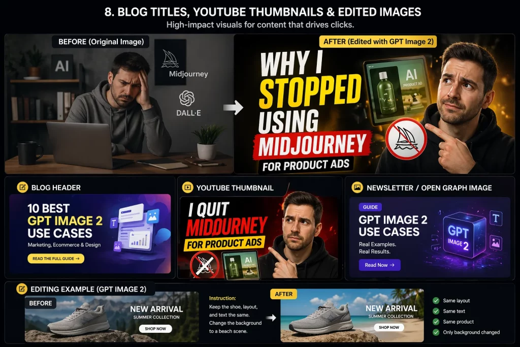
シナリオ例: あるYouTubeクリエイターが「私が商品広告にMidjourneyを使うのをやめた理由」という動画のサムネイルを求めています。典型的なサムネイルの作り方は明確です。感情に訴える構図、読みやすいタイトルテキスト、印象的な中心オブジェクト、そしてストーリーを邪魔することなく引き立てる背景です。GPT Image 2は、特にレイアウトやテキストの階層構造が指定されている場合、こうした方向性を素早く実現するのに役立ちます。.
最も効果を発揮する場面: 毎週記事を配信するコンテンツチーム、マルチチャネル配信システムを運用するクリエイター、そして毎回デザインを待つことなくより強力なページプレゼンテーションを求めるSEOチーム。.
9.研修資料および教育コンテンツ
教育分野は、GPT Image 2にとって意外にも強い分野です。なぜなら、学習教材はイラスト、ラベル、順序付け、そして明瞭さを兼ね備えていることが多いからです。まさに、テキストのレンダリングとレイアウトの制御精度が大きな違いを生む種類の仕事と言えるでしょう。.
OpenAIのガイダンスとMicrosoftのエンタープライズ向けポジショニングは、いずれもこの分野を推奨しています。コース教材、社内オンボーディング資料、ビジュアルSOP、解説コンテンツなどを作成する場合、このモデルは、従来のツールで管理されていたものよりもはるかに実用的な図、プロセスフロー図、ラベル付きイラスト、概念図の生成に役立ちます。.
シナリオ例: 社内のイネーブルメントチームは、顧客オンボーディングのワークフロー(リード獲得、資格審査、デモ、セットアップ、アクティベーション、顧客維持)を説明する図表を必要としています。矢印とボックスだけのシンプルなスライドを作成するのではなく、より洗練された、デザイン性の高い解説資料に近いビジュアル資料を作成することができます。.
効果がある理由: 教育用ビジュアルにおいては、芸術的な独創性よりも明瞭さが重視される。これはまさにGPT Image 2の強みに合致する点だ。.
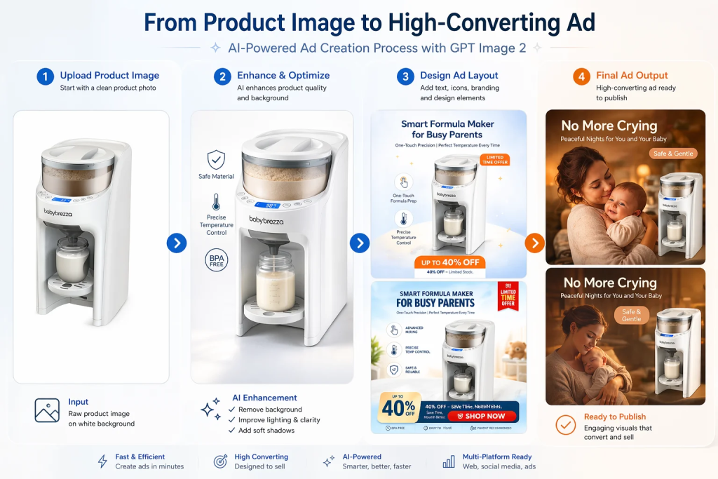
10. 既存のブランド資産に対する高精度な編集
すべてのワークフローが白紙の状態から始まるわけではありません。実際、クリエイティブチームにおける最も価値のある仕事の多くは、背景の変更、CTAの更新、オブジェクトの削除、テキストのローカライズ、被写体の維持、ブランドカラーの保持、構図の維持といった、細かな編集作業です。こうした作業は説明するのは簡単ですが、繰り返し行うには途方もなく時間がかかります。.
ここでGPT Image 2が特に実用的になります。OpenAIのガイドラインでは、編集時にレイアウトとアイデンティティを維持することに重点を置いており、Microsoftが地下鉄のモックアップで広告コンテンツを繰り返し変更する例は、それが実際にどれほど役立つかを示す良い例です。.
シナリオ例: マーケティングチームは、キャンペーン用のビジュアルを1つ用意していますが、春バージョン、夏バージョン、ドイツ語版、バッジの位置を変更したバージョン、モバイル向けに背景を簡略化したバージョンの5つのバージョンが必要です。これら5つすべてを手作業で作り直す代わりに、チームは「ここだけを変更して、他はすべてそのままにしてください」という画像編集プロンプトを使用できます。“
それは大きな変化だ。. つまり、AIによる画像生成はもはや新規画像制作のためだけのものではなく、通常のクリエイティブ作業の一部にもなり得るということだ。.
では、GPT Image 2を実際に選択すべきなのはどのような場合でしょうか?
ワークフローが読みやすいテキスト、高品質な製品画像、UIのようなレイアウト、または精密な編集に依存する場合、GPT Image 2は通常、非常に有力な選択肢となります。OpenAI自身も、絶対的な最低コストよりも画像品質、編集の信頼性、および制作価値が重要な新規構築においては、GPT Image 2をデフォルトとして使用することを推奨しています。.
とはいえ、すべてのユースケースで同じレベルの忠実度が必要なわけではありません。リスクの低いドラフトや大量の実験であれば、より安価で低品質な設定でも十分な場合もあります。しかし、顧客向けのアセットを作成したり、手戻りを減らしたりする場合は、GPT Image 2の優れた初回品質によって、そのコストを十分に回収できるでしょう。.
より良い結果を得るためのベストプラクティス
最後に、常に役立つ実践的な習慣をいくつかご紹介します。
- 資産の種類を明確に示してください。. それが製品モックアップ、インフォグラフィック、UI画面、ブログヘッダー、バナー広告のいずれであるかを明記してください。.
- 正確な文言を引用符で囲んでください。. これは特に、見出し、CTAボタン、ラベル、パッケージテキストに役立ちます。.
- 変更してはならない事項を説明してください。. 編集の際は、レイアウト、アイデンティティ、角度、照明、ブランド要素、必要に応じてタイポグラフィを維持するなど、明確に指示してください。.
- レイアウト言語を使用してください。. 配置、余白、フレーミング、階層構造について言及してください。.
- 最初のプロンプトに過負荷をかけないでください。. まずはしっかりとした基本案を作成し、その後、細かな修正を加えて洗練させていく。.
最後の点は非常に重要です。実際のワークフローでは、最良の結果は通常、一度の「完璧な指示」ではなく、反復作業によって得られます。“
最後に
人々がGPT Image 2に期待を寄せている理由は、それが突然デザイナーや写真家を置き換えるからではありません。そのような見方はあまりにも単純すぎます。より現実的な見方は、既存のワークフローにおけるボトルネックを解消するということです。チームがアイデアから実用的なドラフトへとより迅速に移行できるよう支援し、マーケティング担当者がより多くのコンセプトをテストできるようにし、eコマースチームがより多くのバリエーションを作成できるようにし、コンテンツチームがより多くのビジュアルを配信できるようにし、そして製品チームが本格的なデザインプロセスが始まる前にアイデアを共有できるように支援します。.
だから GPT Image 2の最適なユースケース これらは無作為な芸術実験ではない。それらは反復的で実用的、かつビジネス的な作業であり、制御と可読性が重要となる。.
参考文献
- OpenAIクックブック:GPT画像生成モデルプロンプトガイド
- OpenAIクックブック:画像生成および編集ユースケースのための画像評価
- Microsoft Foundry: OpenAIのGPT-image-2を紹介
- MindStudio: GPT 画像 2 の使用例