








Social Media Graphic Design Tips for a Readable Image Card Series
Good social graphics are not only a matter of choosing a beautiful style. A card series also has to carry the right words, one idea at a time, at a usable ratio, with enough consistency that the reader understands the relationship between cards.
This article uses Social Card Series Creator (xhs-card-series-creator) as a worked example. The Skill produces a coherent image card series from an article, guide, review, tutorial, or story. It does not publish the result to a social platform.
Separate the design decisions
When a result feels “off,” the cause is often unclear because several decisions were bundled together. Separate them:
| Decision | What to specify | What to inspect |
|---|---|---|
| Text | exact visible phrases | spelling, omissions, extra copy |
| Density | one idea per card | whether the card can be scanned |
| Format | aspect ratio and target surface | cropping and usable hierarchy |
| System | style, layout, palette | whether the cards belong together |
| Sequence | cover, content, ending roles | whether the series has a clear flow |
The Skill exposes style, layout, palette, and aspect-ratio choices, but those controls do not replace review. A parameter is a request; the generated image is the evidence to inspect.
Tip 1: lock the text before styling
Write the exact phrase each card must show. Keep the phrase short enough to remain readable, and do not add a second message just because there is empty space. If a source contains a technical term or proper noun, copy it exactly into the brief and check the returned image.
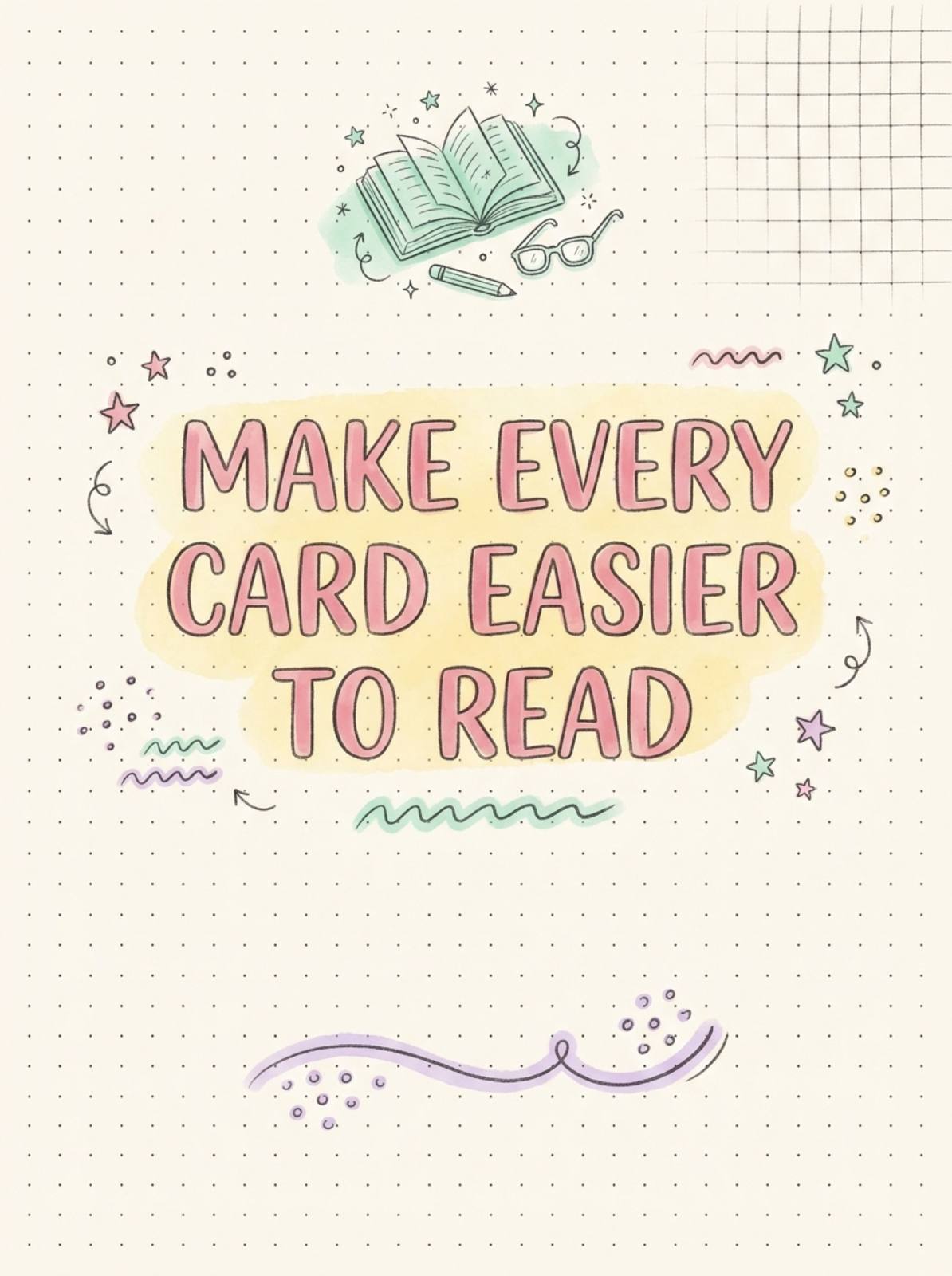
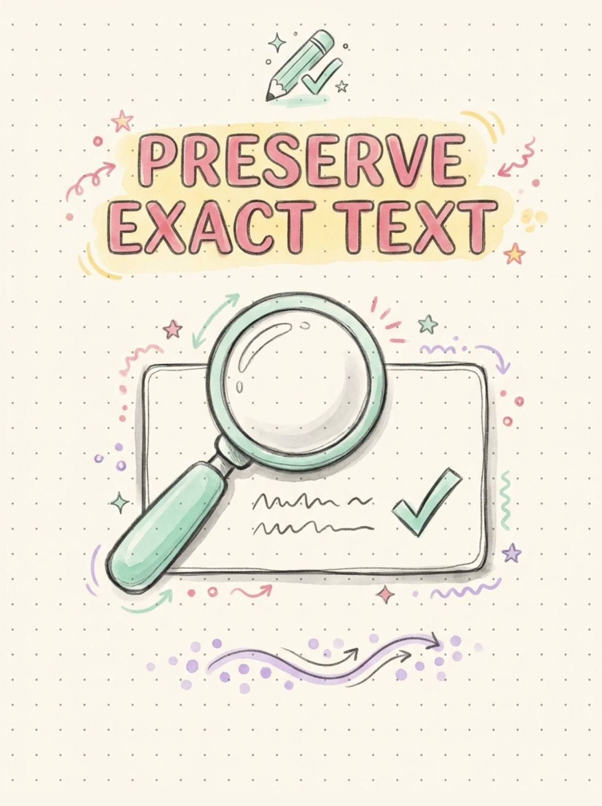
In the example below, the four requested phrases were explicit: “MAKE EVERY CARD EASIER TO READ,” “ONE IDEA PER CARD,” “PRESERVE EXACT TEXT,” and “REVIEW THE FULL SERIES.” The visual result was reviewed against that allowlist rather than judged only by overall mood.
Start with constraints that can be reviewed, not vague style adjectives.
Tip 2: use one idea per card
One idea does not mean one word. It means a reader can state the card’s job in one sentence. A card may include a short explanation or illustration, but it should not compete with several unrelated claims.
For a dense guide, split the source into claims first, then assign each claim to a card. This is also the point where the repurposing companion article helps: it explains how to go from source structure to card roles before visual decisions.
Tip 3: choose the ratio as a constraint
The canonical Skill maps a 3:4 option to a 1242×1660 physical canvas and supports other ratios. That does not guarantee that every downstream platform will display the image identically. Choose the target ratio, then inspect the actual composition for readable hierarchy and safe cropping.
Do not solve a layout problem by shrinking all text. If the content no longer reads at the intended size, shorten the visible phrase, split the idea across cards, or revise the composition brief.
Tip 4: check consistency across the full set
Consistency has several layers:
- visual language: style and palette belong together;
- structural language: repeated margins or layout logic help scanning;
- narrative language: the order makes sense;
- textual language: capitalization and terminology stay stable.
Review the cards individually and then as a grid. The second view reveals repeated illustrations, abrupt palette changes, or a final card that does not look like part of the same series.
The set passes when each card and the complete series are readable.
The Test case behind these images produced four distinct English portrait cards. The requested phrases were reviewed exactly; the order returned by generation differed from the requested order, so the article uses the cards as QA evidence rather than claiming a fixed generation order. That is an important distinction: the Skill can generate a series, but the operator still verifies sequence and text.
Tip 5: make review observable
Use a small acceptance checklist:
- Is the visible text exact?
- Is the main idea identifiable within a glance?
- Does the selected ratio survive the intended crop?
- Are style, layout, palette, and terminology consistent?
- Does the complete series have a cover, useful content, and a close?
Record failures by dimension. “The design is wrong” is hard to fix; “Card 2 has two competing claims” or “the ending card repeats the cover” is actionable.
What the Skill does not promise
Image generation can vary. Exact text, composition, and small decorative details should be checked in the returned assets. This workflow also does not measure click-through rate, saves, or engagement. Those are downstream outcomes and require separate analytics.
If the cards need a stronger narrative arc, continue with How to Use Social Storytelling in an Image Card Series. If the main challenge is source decomposition, return to the parent repurposing guide.
Try it
Start with a short text allowlist, one idea per card, a target ratio, and a review checklist. The more concrete the acceptance criteria, the easier it is to improve the next run.
About The Author