




Logo Design Brief: What You Get Before a Designer Starts
If a logo project usually means finding a designer, waiting for a first draft, revising the brief, and waiting again, the first useful question is not “Can AI make my final logo?” It is “Can I get three serious directions to react to before that queue starts?”
Logo Design is built for that first exploration round. Give it a brand brief, audience, personality, usage scenes, must-keep elements, and things to avoid. It returns a structured brief, three different concept directions, a recommended route, palette and typography guidance, variants, favicon guidance, and a delivery specification.
That last distinction matters: these are concept directions, not promised editable vector files.
What the Skill actually changes in the workflow
The old workflow is familiar: find a designer → wait for the first draft → explain what feels wrong → revise the copy or direction → wait for another round. For one SKU, the full loop can take two or three days. The cost and time were not measured here, so this article does not invent a saving percentage.
Logo Design removes one specific delay: the empty-page exploration before anyone has agreed on a direction. You can arrive at a designer handoff with a clearer brief and a small set of routes to compare.
It does not remove final production, trademark review, or the need for a human to check whether the mark works at small sizes.
What to put in a logo design brief
Start with the information the Skill actually asks for:
- brand or product name;
- what the brand does and who it serves;
- personality and visual mood;
- where the logo will appear, such as a website, product page, app icon, or print;
- must-keep elements;
- colors, symbols, or associations to avoid;
- an optional reference logo.
You do not need a polished creative brief before starting. The point of the first pass is to turn rough business context into something a designer—or your next internal review—can work with.
One verified Canvas case: Ima Studio Logo
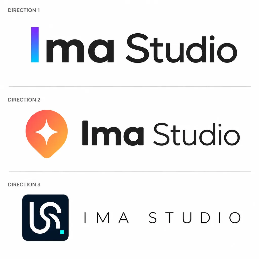
The Ima Studio Logo design Canvas project contains a successful logo-design run. The project is public and includes a session titled “Ima Studio Logo设计”. Its output includes a GPT Image 2 concept sheet with three directions:
The same project also contains a separate Pulse Mark sheet showing light, dark, and monochrome treatments:
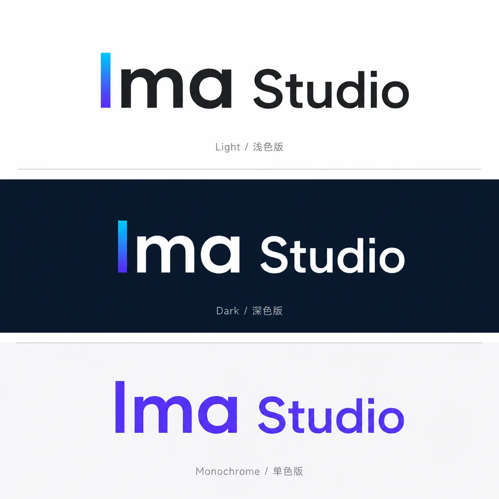
That second sheet is useful for discussing color behavior and presentation, but it is not evidence that every request will produce the same number of usable options or finish at the same speed.
The case answers one narrow question: can the Skill turn one brand brief into visibly different logo routes and a follow-up presentation of variants? Yes, this run did. It does not answer whether the output is ready to upload as a final product-page logo.
Three directions should mean three construction ideas
Three color swaps are not three directions. A useful set changes the construction logic, type family, or visual grammar.
For example, the case above separates a pure wordmark, a symbol-plus-wordmark, and an interlocked lettermark. Those routes give the team something to discuss: should the brand be remembered through typography, a standalone symbol, or a compact emblem?
That is a better review conversation than “make it more modern.” You can compare silhouette, wordmark weight, small-size recognition, and how much the mark depends on a color effect.
Can a reference logo make the result more accurate?
It can make the brief more specific, but it should not turn into a copying request.
Logo Design uses a reference for observable principles—stroke rhythm, negative space, proportion, palette cadence, or typographic mood. It explicitly rejects copying a recognizable trademark silhouette, lettering, mascot, watermark, or distinctive combination.
So “use this as a style reference” is a workable input. “Make it identical” is not. If the reference image cannot be analyzed, the safe answer is to work from your written description rather than invent details about an unseen mark.
Can I put the generated logo straight on a product page?
Not as a final-production guarantee.
The Skill’s own boundary is clear: model-generated lettering is not final typography, and formal lettering, editable vectors, and production files still need a design-tool handoff and review. Before publishing a product page, have a designer check the chosen direction, redraw or clean up the mark where needed, verify spacing, and export the required formats.
Think of the output as a fast, structured starting point. It can replace waiting to discover what you might want. It cannot replace the last production and rights checks.
A short review checklist before handoff
Use the recommendation and delivery specification as a review gate:
- Does the silhouette remain recognizable in one color?
- Is the icon the same visual weight as the wordmark?
- Does the mark work at 16×16 and 32×32?
- Are light, dark, monochrome, horizontal, and stacked versions defined?
- Is the clear space and minimum size written down?
- Are favicon/app-icon, print, emboss, and embroidery constraints covered?
- Which files still need to be produced in a design tool?
If the favicon is unclear, simplify the mark before adding detail. A polished mockup can hide a weak silhouette; a tiny icon will not.
What is free, and what is still unclear?
The supplied product information says Logo Design can be used on the free tier and that free output carries a watermark. The exact free allowance was not measured in this case, so this article does not state a credit number. Check the current account view before planning a large batch.
Start with the first exploration round
If your bottleneck is a designer’s schedule, start with the information you already have: brand name, audience, personality, use scenes, must-keep elements, and what you want to avoid.
Then make the final production decision with the right person: a designer for vectors and typography, and a qualified reviewer for trademark questions.
Related reading
- GPT Image 2 Prompt Guide: How to Write Better Prompts
- What Makes a Good Infographic? 8 Checks Before You Publish
- How to Turn Content Into an Infographic With AI
About The Author