







Content teams often have useful source material that is too dense for a quick reader: product explanations, reports, tutorials, operating frameworks, and knowledge summaries. Turning that material into one infographic is not mainly an image-generation problem. The hard part is deciding which facts must survive, which relationship the layout should express, and which words may appear in the final visual.
Ima Studio’s Content Operations Infographic Skill uses that fact-first workflow. You provide the source, audience, channel, and constraints; choose or confirm a layout, style, and aspect ratio; then review the generated visual against the source before using it.
New users can try Content Operations Infographic for free.
What This Infographic Workflow Produces
The Skill turns structured source content into one coherent visual summary. It is a good fit for:
- article and report summaries
- product and method explainers
- step-by-step tutorials
- comparison and decision guides
- knowledge and process maps
- content-operations reviews with supplied facts
It is not a spreadsheet, charting library, or automatic research substitute. Exact statistical charts, calculated dashboards, and claims that are not in the source need a reliable data workflow first. A single campaign poster, blog hero, social card series, or slide deck also belongs to a different visual workflow.
How to Turn Content Into an Infographic With AI
1. Build a Fact Ledger Before Designing
Start with the source material, not a visual style. Record the information that the infographic is allowed to use:
- approved title and section labels
- facts, numbers, units, and time ranges
- quoted or attributed material
- audience and publishing channel
- missing information that must remain missing
- wording that must appear exactly as supplied
If a comparison needs last month’s result but the source only contains this month’s number, do not invent the missing value or calculate a growth rate. Ask for the data, use an explicit placeholder, or change the visual to a qualitative structure.
2. Match the Layout to the Information Relationship
Layout is the logic of an infographic. Choose it from the relationship in the source rather than from appearance alone.
| Information relationship | Useful layout direction |
|---|---|
| Independent modules | bento grid or dense modules |
| Ordered steps | linear progression |
| Two alternatives | binary comparison |
| Several criteria | comparison matrix |
| One central idea | hub and spoke |
| Parent-child structure | tree branching |
| Repeating process | circular flow |
| Narrowing stages | funnel |
| Supplied metrics | dashboard structure |
A dashboard layout does not require a dark software-interface style. Layout controls reading order; style controls the visual language.
3. Choose a Style Separately
When no style is specified, the Skill starts from a light craft-handmade direction: warm paper, hand-drawn lines, organic shapes, illustration icons, and generous whitespace. Other supported directions include hand-drawn-edu, morandi-journal, storybook-watercolor, bold-graphic, retro-popup-pop, corporate-memphis, and pop-laboratory.
Choose from the audience and channel. A product explainer may benefit from a clean corporate vector treatment; an educational guide may work better with a handmade or hand-drawn direction. A dark SaaS dashboard look should only appear when it is explicitly selected.
4. Lock the Visible Text and Generation Settings
Before generation, confirm:
- output language
- layout and style
- aspect ratio: 9:16, 3:4, 1:1, 16:9, or 4:3
- exact visible-text allowlist
- reference-image responsibility, if a reference is supplied
- forbidden additions such as invented labels, numbers, logos, or footers
Keeping the visible-text list short and explicit makes review possible. It does not guarantee perfect image text, so every result still needs inspection.
5. Generate, Review, and Revise One Variable at a Time
Review facts before visual polish:
- Does every visible claim come from the fact ledger?
- Are labels, numbers, units, and time ranges exact?
- Does the reading order match the selected layout?
- Does the image match the selected style rather than a generic fallback?
- Is the text readable at the intended size and free from clipping?
- Did icons or decorations introduce extra letters, symbols, or pseudo-text?
If the result fails, identify whether the problem belongs to content, layout, style, aspect ratio, or the reference image. Change that variable while keeping the approved facts and constraints fixed.
Verified Example: One Brief, One 4:3 Infographic
The following controlled Test case used a deliberately small visible-text set to demonstrate the latest 4:3 visual direction. It was generated by infographic-creator in Test on August 5, 2026.
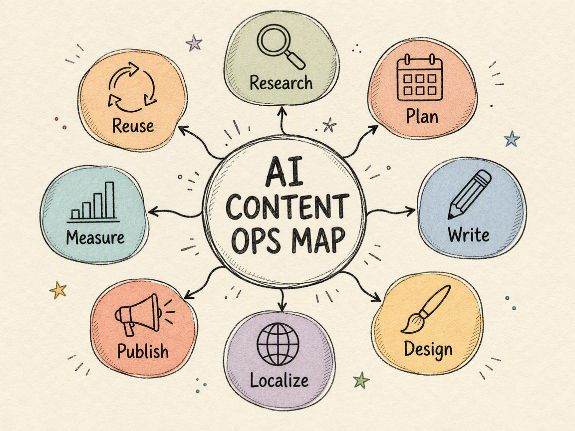
The run used the hub-spoke layout and hand-drawn-edu style direction. After the generation gate was approved, it produced one physical PNG. Manual review confirmed:
- one centered hub with eight connected stages
- the approved title and eight labels appearing once each
- no extra readable text
- warm paper texture, pastel organic nodes, and sketch-like linework
- clear icons and labels without a dark software-interface treatment
- the requested 1152×864, 4:3 output
This case confirms the tested workflow and result. It does not guarantee identical pixels, perfect text in every future generation, or a marketing performance outcome.
What the Current 4:3 Style Range Looks Like
The same concise content map was also used as a controlled comparison across several visual directions. Four reviewed results were assembled into the current Prod Homepage positioning media:
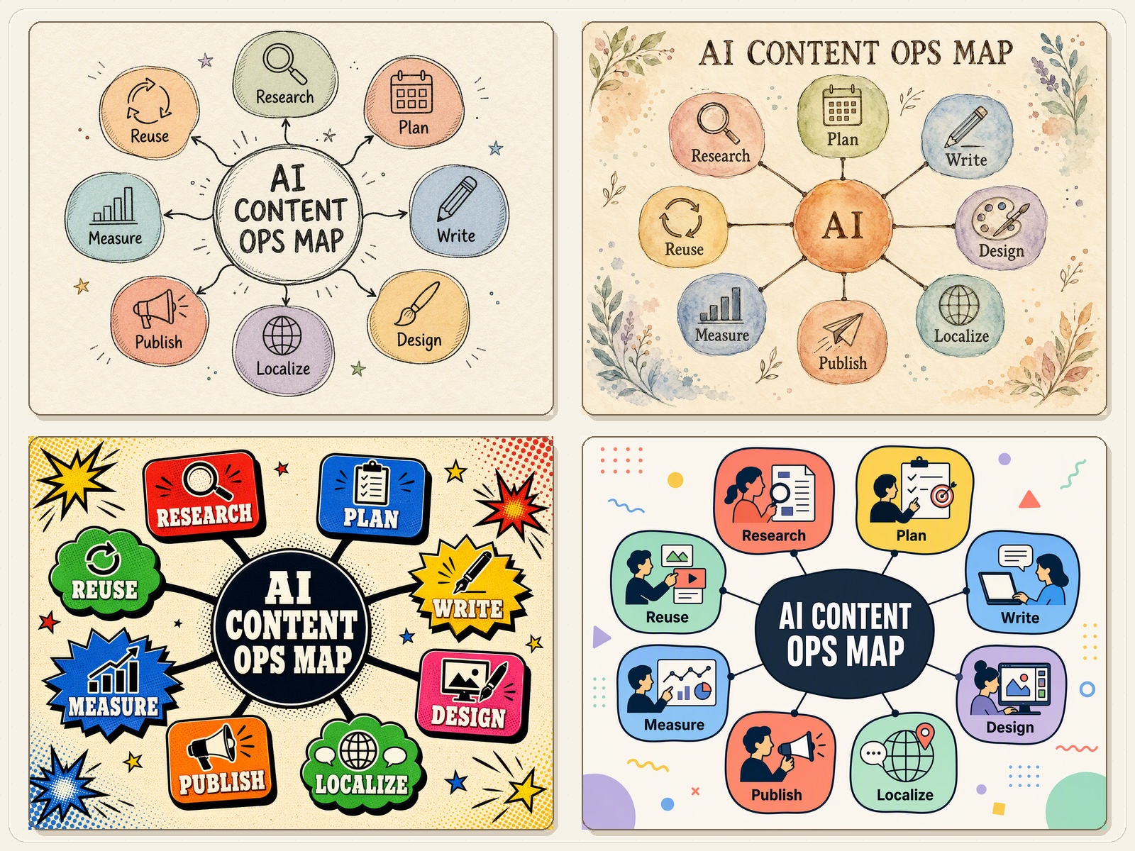
- Hand-drawn education uses warm paper, sketch lines, and soft pastel nodes.
- Storybook watercolor adds watercolor washes, botanical accents, and a gentler editorial mood.
- Retro popup pop uses heavy outlines, halftone texture, and saturated comic color for high-impact communication.
- Corporate Memphis uses bright rounded modules, flat vector people, and clean geometric accents for product and business explainers.
A Reusable Infographic Brief
Use a brief that separates source facts from visual choices:
Source: [paste the article, report, tutorial, or approved notes]
Audience and channel: [who will read it and where]
Core takeaway: [one sentence supported by the source]
Exact facts: [labels, values, units, dates, and sources]
Layout: [auto or one supported layout]
Style: [auto or one supported style]
Aspect ratio: [9:16, 3:4, 1:1, 16:9, or 4:3]
Visible text: [the exhaustive wording allowed in the image]
Reference image: [optional; state whether it controls style, palette, composition, or subject]
Must avoid: [invented facts, extra copy, logos, protected elements, or other restrictions]
This is a user-facing Brief, not an internal generation prompt. The Skill uses the selected layout and style Knowledge to assemble the detailed image prompt.
When to Use Another Workflow
| Need | Better-fit workflow |
|---|---|
| Exact charts, axes, or calculated statistics | data visualization or charting workflow |
| One campaign poster or article hero | cover/KV workflow |
| Several connected social images | social card series workflow |
| A 6–12-page visual presentation | slide deck workflow |
| Editable brand typography or print-ready production | professional design and typesetting workflow |
For an overview of the available formats, browse the AI Visual Tools guide.
Limits and Variability
Generative results vary with source density, language, layout, style, aspect ratio, reference images, and the underlying image generation. Treat the first result as a visual candidate, not an automatically approved final asset.
For brand-critical typography, regulatory copy, exact production text, or print-ready artwork, keep an approved text version and layout specification, then complete final typesetting in Figma, Photoshop, Illustrator, or the team’s normal production tool.
Try Content Operations Infographic for Free
New users can try Content Operations Infographic for free. Bring an article, tutorial, product explanation, report, or knowledge summary. Define the facts that must survive, select the layout and visual direction, and review the generated result against the source.
Ready to turn source content into one structured visual?
Want to see this workflow applied to real business scenarios first? Read 5 Business Infographic Examples for Content and Marketing Teams for customer journey, funnel, content operations, comparison, and timeline examples with reusable Briefs.
FAQ
Can it turn a long tutorial into one infographic?
Yes, when the source can be reduced to a readable set of steps or modules. If the content exceeds one image’s capacity, split it into a series rather than forcing the text into a smaller type size.
Can it visualize data?
It can organize supplied metrics inside an infographic, but it should not invent, calculate, or research missing values. Use a charting or data workflow when exact statistical graphics are required.
How do I keep the visible text accurate?
Provide an exhaustive list of the wording that may appear, including exact labels, numbers, units, and dates. Review the generated image character by character and regenerate when it adds, removes, or rewrites text.
Which aspect ratios are supported?
The current Skill supports 9:16, 3:4, 1:1, 16:9, and 4:3. Choose from the publishing surface and the amount of information rather than from a universal default.
Can I provide a reference image?
Yes. State whether the reference should control style, palette, composition, or subject treatment. A reference does not authorize copying its text, logo, people, or protected visual elements.
Is Content Operations Infographic free to try?
Yes. New users can try the Skill for free.
Will every generation look the same?
No. The Brief defines the content and design contract, but the generated pixels can vary. Review every result before publishing or handing it to production.
About The Author