







Business infographic examples are useful only when the visual structure matches the source material. A funnel implies that stages narrow. A timeline needs real time points. A comparison needs the same dimensions on both sides. A loop means the final stage feeds the first.
The five examples below are real outputs from Ima Studio’s Content Operations Infographic Skill, not empty templates. Each case starts from a closed set of supplied labels or facts, uses one information relationship, and ends with a reviewable 4:3 image.
Choose the Relationship Before the Style
Start with what the source is saying. Style changes the visual language; layout changes the meaning.
| Source relationship | Better-fit layout | Example in this guide |
|---|---|---|
| Ordered stages without dates | Linear progression | Customer journey |
| Stages that narrow toward an outcome | Funnel | Marketing launch funnel |
| Work that repeats | Circular flow | Content operations loop |
| Two options judged on matched dimensions | Comparison matrix | Tutorial versus case study |
| Milestones with supplied time points | Timeline / linear progression | Five-week content launch |
This distinction matters because the wrong shape can add a claim. A funnel can imply drop-off even when no reduction exists. A timeline can imply timing that the source never provided. The Skill should organize supplied facts, not invent the facts required to make a preferred layout look complete.
1. Customer Journey: Use a Linear Process for Ordered Stages
A customer journey can be a linear process when the source contains ordered stages but no dates or durations. This example uses five supplied labels and does not turn them into a measured funnel or a dated timeline.
Task: Show five ordered customer stages
Visible text: JOURNEY; Discover; Compare; Try; Adopt; Advocate
Layout: Linear progression
Style: Craft handmade
Aspect ratio: 4:3
Must avoid: Invented dates, durations, rates, metrics, subtitles, sources, logos, and footers
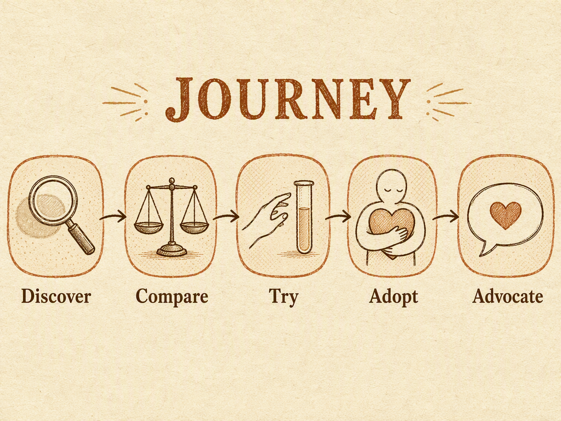
Use this structure for onboarding stages, approval steps, editorial handoffs, or other one-way sequences. If a process can branch, return to an earlier stage, or run in parallel, a single straight path may hide important behavior.
2. Marketing Funnel: Use a Funnel Only When Stages Narrow
Marketing infographic examples often use funnels, but a funnel is not a generic decoration. It represents reduction, filtering, or progression toward a smaller set. This qualitative example supplies stage names but no rates.
Task: Show five progressively narrower marketing stages
Visible text: FUNNEL; Awareness; Interest; Trial; Purchase; Repeat
Layout: Funnel
Style: Craft handmade
Aspect ratio: 4:3
Must avoid: Invented conversion rates, percentages, benchmarks, drop-off claims, sources, logos, and footers
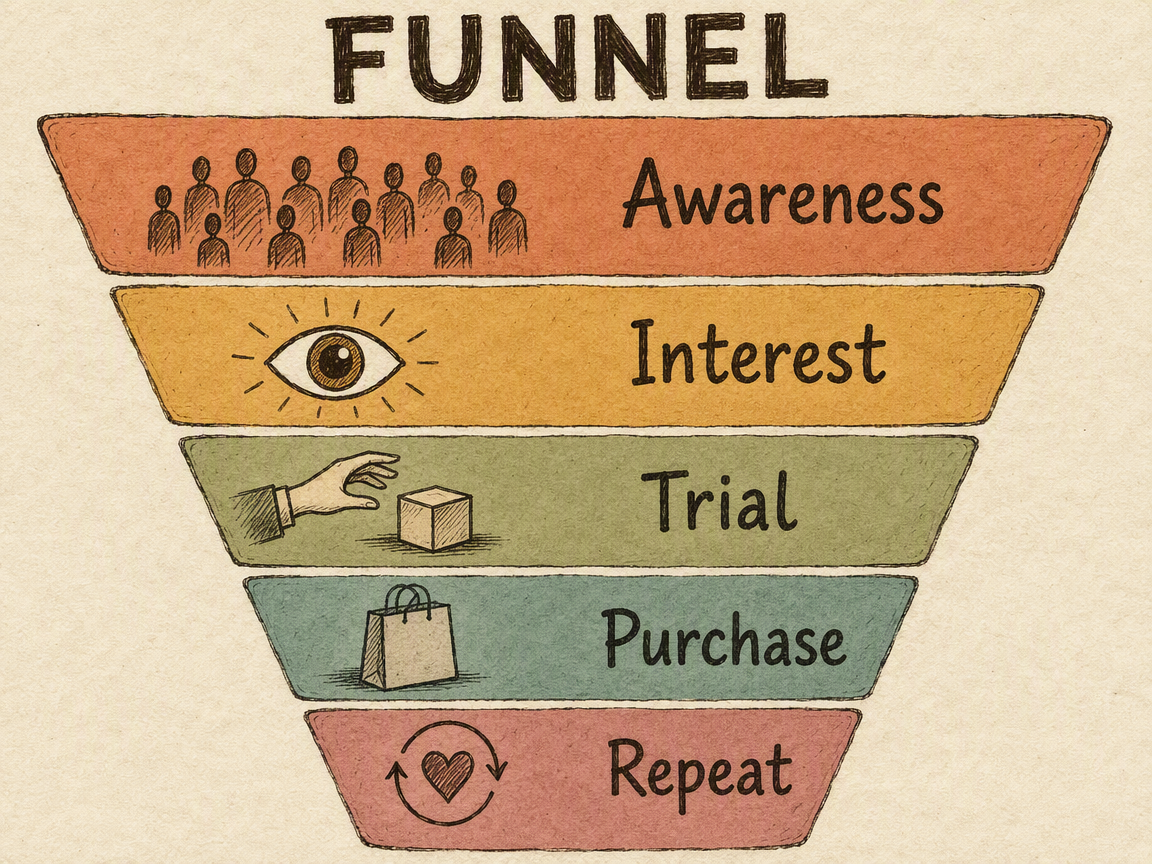
If you have real counts, rates, time windows, and sources, preserve them exactly in the Brief and review every value in the final image. If you do not have the data, keep the result qualitative as this case does.
3. Content Operations Loop: Use a Cycle for Repeating Work
Some process infographic examples are not step-by-step lines. When measurement and improvement change the next brief, the source describes a cycle.
Task: Show one repeating content workflow
Visible text: LOOP; Brief; Draft; Review; Publish; Measure; Improve
Layout: Circular flow
Style: Craft handmade
Aspect ratio: 4:3
Must avoid: Invented KPIs, outcomes, channel names, subtitles, sources, logos, and footers
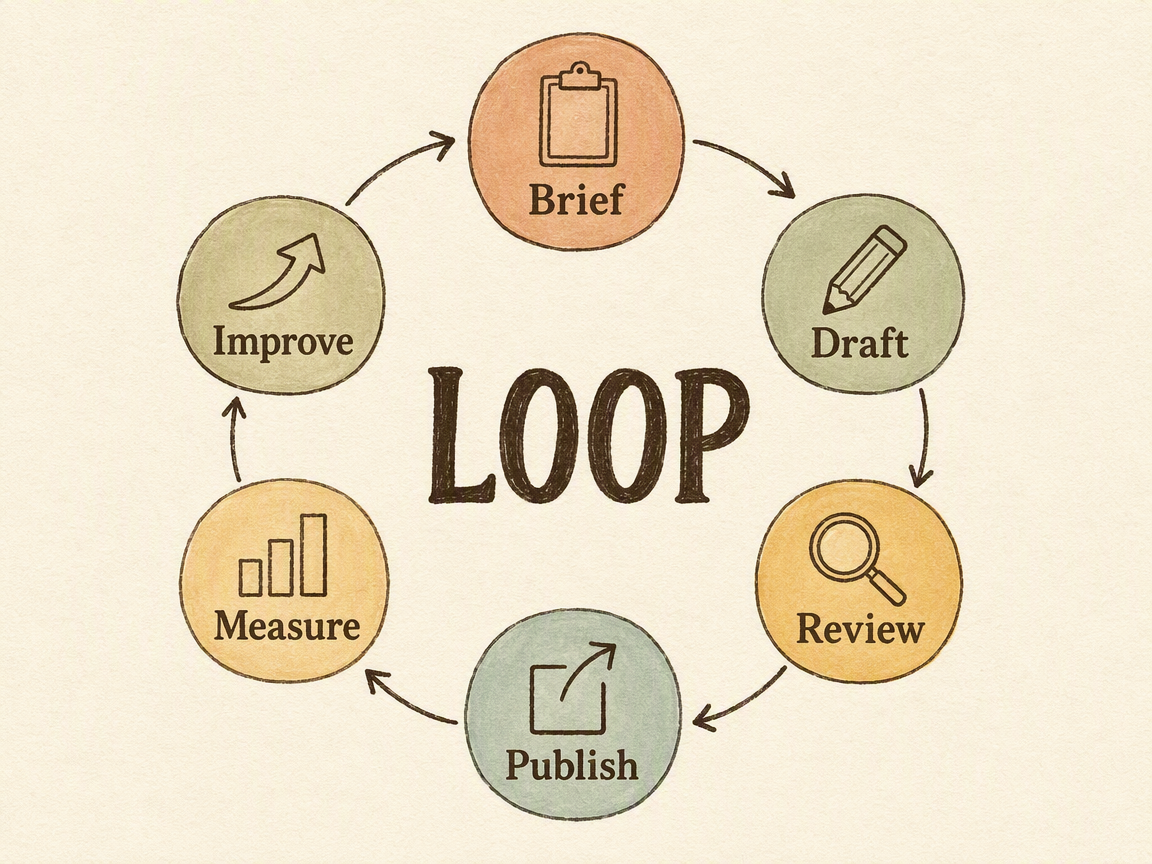
Use a circular layout only when recurrence is part of the operating model. If the task ends after publishing, a linear process is more honest. If several stages happen at once, a loop may still be too simple.
4. Comparison Matrix: Compare the Same Dimensions
A comparison infographic becomes useful when both options are described at the same level of detail. The source below provides two editorial formats and four matched dimensions. These statements are illustrative inputs for the example, not universal rules for every tutorial or case study.
Title: Tutorial vs Case Study
Purpose: Teach a method | Show an outcome
Evidence: Steps and rules | Actions and results
Structure: Sequence | Problem to result
Next step: Try the workflow | Inspect the result
Layout: Comparison matrix
Style: Craft handmade
Must avoid: Duplicate dimension labels, invented scores, winners, statistics, sources, logos, and footers
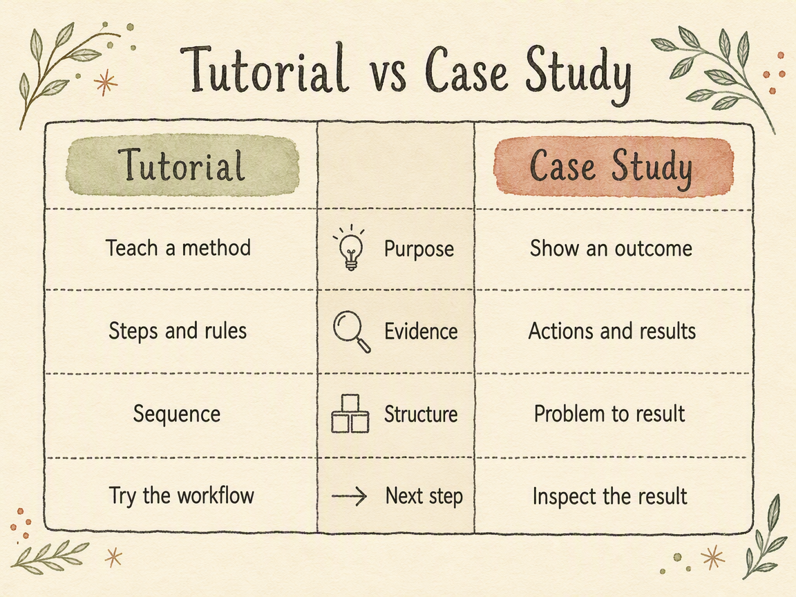
The first generated candidate repeated every dimension label in both columns. It was visually attractive but failed the visible-text contract, so it was rejected and regenerated with one center-column position per dimension. That review step is part of the workflow, not an optional polish pass.
5. Content Launch Timeline: Supply Real Time Points
Timeline infographic examples need time. A customer journey with five stages is not automatically a timeline; it becomes one only when the source includes dates, weeks, quarters, years, or another explicit time scale.
Task: Show a five-week content launch
Milestones: Week 1 Research; Week 2 Positioning; Week 3 Production; Week 4 Launch; Week 5 Review
Layout: Linear progression used as a timeline
Style: Corporate Memphis
Aspect ratio: 4:3
Must avoid: Invented dates, owners, deliverables, statistics, performance claims, platforms, sources, logos, and footers
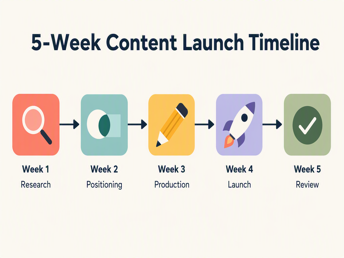
Use the same approach for a product roadmap, company history, event plan, or project schedule: supply every time point and event you expect to see. If the dates are unknown, choose an ordered process rather than inventing a timeline.
Turn Your Source Into a Reviewable Brief
Across all five examples, the reusable pattern is the same:
- List only the facts, labels, dates, values, units, and sources the image may use.
- Identify the relationship: sequence, narrowing, cycle, comparison, hierarchy, or another supported structure.
- Choose layout and style separately.
- Define aspect ratio, audience, channel, and an exhaustive visible-text list.
- Generate one image, then review every visible string, relationship, icon, reading order, and crop against the Brief.
For a deeper walkthrough, read How to Turn Content Into an Infographic With AI: A Fact-Safe Workflow.
What This Skill Does Not Replace
Content Operations Infographic creates one visual candidate from supplied source material. It does not calculate missing statistics, research industry benchmarks, or guarantee that every generated word will be correct.
Use another workflow when you need:
- exact charts, axes, calculations, or statistical analysis;
- a multi-card social series rather than one image;
- a slide deck with several pages;
- a campaign poster or article hero;
- editable brand typography or print-ready production files.
For brand-critical, regulatory, or production text, keep an approved text copy and complete final typesetting in Figma, Photoshop, Illustrator, or your normal design workflow.
Try Content Operations Infographic
Bring a process, comparison, timeline, product explanation, article, or operations review. Supply the facts that must survive, choose the information relationship, and review the result against the source.
Ready to turn supplied content into one structured infographic?
FAQ
What makes a business infographic different from a generic visual?
It communicates a business relationship such as a process, comparison, timeline, funnel, or supplied set of metrics. The layout should make that relationship easier to inspect without adding a claim the source does not support.
Can I include exact numbers in a business infographic?
Yes, when you supply the exact values, units, time ranges, labels, and sources. The Skill should preserve them, not calculate or invent missing data. Review the generated image character by character before using it.
When should I use a timeline instead of a process infographic?
Use a timeline when the source includes explicit time points. Use a process when the important fact is the order of actions rather than when they happen.
Can it create a comparison infographic?
Yes. Supply the options and the same comparison dimensions for each one. Avoid invented scores, uneven detail, or color that implies an unsupported winner.
Can I use one of these infographics on social media?
Yes, after choosing an aspect ratio and text density that fit the channel. The Skill creates one infographic image; it does not publish the image or replace a multi-card social-series workflow.
Are the results editable templates?
No. The output is a generated image candidate. For editable layouts, precise brand typography, or print-ready files, rebuild the approved design in a professional layout tool.
About The Author