







Both pictures below came out of the same infographic generator, from the same source material, minutes apart. Both are clean, legible and pleasant to look at. One of them was rejected.
What separates them is not taste. It is a rule you can check: a good infographic makes no claim its source material did not make. Every visible string, every arrow, every shape either traces back to something you supplied or it does not belong there.
That definition is unusual because it is checkable. “Simple”, “clear”, “well-designed” and “tells a story” are all true and none of them tell you whether to hit publish. The eight checks below do.
An Attractive Infographic Can Still Be Wrong
Here is the rejected candidate. The task was to compare two editorial formats across four matched dimensions.
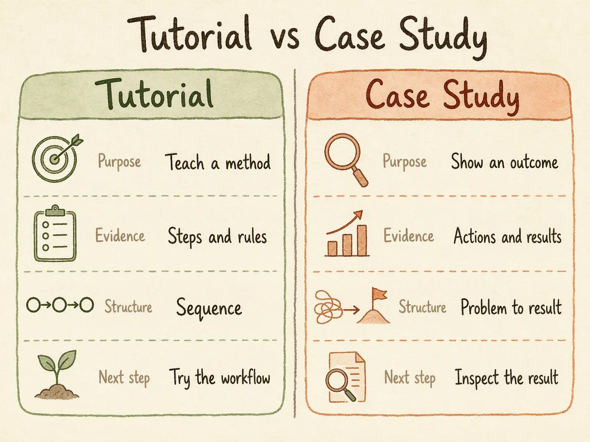
The approved text for this image contained fifteen strings, and the four dimension names were each meant to appear once. In this result they appear twice — once inside the Tutorial column, once inside the Case Study column.
That is easy to shrug at. It should not be. A dimension label is the thing both sides are being judged on; printing it inside each side quietly turns one shared axis into two independent ones. And more practically: if the generator duplicated four strings without being asked, nothing so far tells you it did not also adjust a number.
The corrected result moved every dimension label into a single narrow center column. It also changed several other things at once, which we come back to later — it is a useful lesson in its own right:
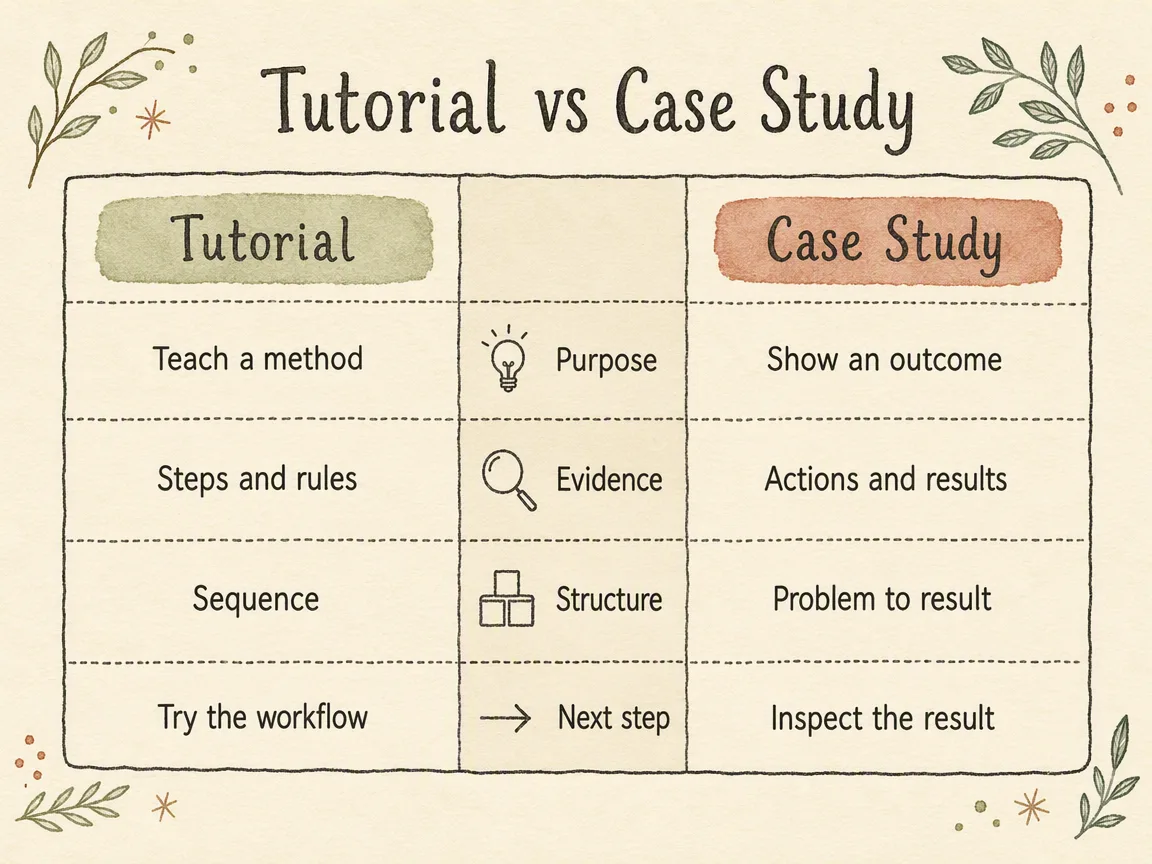
Nobody caught the first one by looking at it. It was caught by counting strings against a list.
Before You Generate: Close the Set
Every check further down depends on there being something to check against. So the real work happens before generation, and it is two lists.
The fact list. Every number, date, unit, ranking, quotation, causal claim and source the image is allowed to use. If your source does not have a figure, the correct entry is a visible “TBC” placeholder or a qualitative structure with no numbers at all. “Estimate something sensible” and “fill in a reasonable growth rate” are not instructions a good workflow accepts — they are how an invented benchmark ends up in a deck.
The visible-text allowlist. Every string that is allowed to appear, written exactly as it should appear. This one is stricter than people expect:
- Labels are used verbatim. If your input says
Sign-ups, the image saysSign-ups— notSign-up count, notNew Users, notRegistrations. - If your source has no subtitle, no date range, no footer and no source note, then those fields are empty, not unspecified. “Weekly Key Metrics Overview” is a sentence nobody wrote.
- Text-shaped symbols inside icons count as visible text. A dollar sign in a coin icon is a currency claim. A plus sign in a person icon is a quantity claim.
An infographic that fails the checks below almost always failed here first.
The Eight Checks
Run these on the finished image, in this order. The first is the one that matters most; the rest catch things the first will not.
1. Every fact traces back
Go through the image and the accompanying text and point each number, unit, date, proper noun, comparison and conclusion back to a specific line of your fact list. Anything you cannot point at is a new fact, and a new fact is an immediate fail. Not a note for next time — stop and fix it.
2. No garbled, missing, duplicated or cropped text
Generated type breaks in specific ways: a dropped letter, a doubled word, a line running under a shape, a label clipped by the canvas edge. Read every string out loud once. This is also where the rejected example above was caught — under “duplicated”.
3. The subject is identifiable in about three seconds
Look away, look back. If you cannot say what the image is about and what its main point is before you start reading the modules, the hierarchy is wrong even if every word is correct.
4. Reading order and hierarchy are consistent
One path through the image, and it means the same thing everywhere. If size means importance in the top half, it cannot mean quantity in the bottom half. If arrows mean sequence, they cannot also mean causation three modules later.
5. No shape implies something the source never said
This is the check people skip, and it is where infographics do the most quiet damage:
- a funnel implies narrowing — if your stages do not reduce, it is inventing drop-off;
- a timeline implies real time points — five ordered stages without dates are a sequence, not a schedule;
- size differences imply magnitude — if you supplied no values, equal modules are the honest choice;
- left-to-right order implies precedence — check that you meant it.
The words can all be correct while the shape argues for something else.
6. Icons and decoration carry no stray characters
Zoom in on every icon, badge, border and ornament. Letters, digits, currency symbols, operators, punctuation, emoji and pseudo-text should not be there unless they were on the allowlist. Fix by swapping to a glyph-free pictogram — a cluster of figures instead of a person-plus-sign, a stack of coins with no dollar mark.
7. Nothing was copied out of a reference image
If you supplied a reference, it was there to control style, palette and composition. Check that no people, logos, wordmarks or protected elements from it survived into your output.
8. The style matches the style that was chosen
Compare against the style you actually asked for, feature by feature: the required characteristics present, the forbidden ones absent. The common failure is drift toward a dark dashboard look — deep navy, neon glow, KPI cards — which tends to arrive uninvited when the brief mentions an executive audience.
“For my boss” describes who is reading and how fast, not what the thing should look like. Layout and style are separate decisions: a dashboard layout is an information structure, and it can be rendered in a warm hand-drawn style without contradiction.
Is an Infographic One Page?
Usually, and that is a constraint rather than a format rule. One infographic is one image with one main point.
The failure mode is trying to keep it one page after the content has outgrown it. The symptom is type shrinking: 8-point body text, modules crammed to the margins, an image that is unreadable on the phone where most people will open it.
When your content exceeds what one image holds, the answer is to split it into a series — one point per image — not to shrink the type until it fits. If you are not sure, look at the image at the size it will actually be seen: a timeline post in a feed, a slide on a projector, a thumbnail in a chat client.
How to Ask for Changes Without Breaking What Works
When a check fails, the temptation is to fix everything at once: “make the text right, and also try a lighter style, and maybe 16:9.”
Change one major variable per round. Content, layout, style, aspect ratio, or the role of a reference image — one of them, not several.
The reason is diagnostic, not aesthetic. Generation is not deterministic. If you change three things and the result is worse, you have learned nothing about which change did it, and you cannot get back to where you were.
The corrected example at the top of this article is a good demonstration of the cost, because it broke this rule. Go back and compare the two images. The dimension labels moved to a centre column — that was the intended fix. But the cell text also switched from the handwritten face to a plain sans-serif, the eight per-cell icons became four shared ones, and decorative botanicals appeared in all four corners that were not in the first version.
The retry worked. The duplication is gone and the second image is arguably the better artifact. And it taught us nothing about what fixed it — the centre column, the typography, the icon reduction, or some combination. If the next comparison duplicates its labels again, that experience does not help, because nothing was isolated.
That is the whole argument for one variable at a time, and it is easier to believe from a case where the discipline lapsed than from one where it held.
A useful revision request has three parts: name the failed check, restate the full brief, then ask for the new candidate. Do not patch text onto the bitmap afterwards in an image editor — the words will be right and the file will no longer match any brief you can re-run.
What This Does Not Cover
Content Operations Infographic turns supplied source material into one visual candidate. These checks are about that candidate.
They do not make it:
- an exact statistical chart with axes, error bars or calculated values — use a real charting tool and bring the finished chart;
- a multi-card social series;
- a slide deck;
- a campaign poster or article hero;
- an editable or print-ready file.
For brand-critical, regulatory or print work, keep the approved text separately and do the final typesetting in Figma, Photoshop or Illustrator. What you have is a visual candidate, and calling it that is part of using it well.
Try It on Something You Already Have
Take a process, comparison, timeline or operations review you have already written. Write the fact list first, write the visible-text allowlist second, then generate — and run the eight checks before anyone else sees it.
Ready to turn supplied content into one reviewable infographic?
For the full workflow from source material to finished image, read How to Turn Content Into an Infographic With AI: A Fact-Safe Workflow. To choose the structure before you generate, see 5 Business Infographic Examples for Content and Marketing Teams.
FAQ
What makes a good infographic?
One that adds nothing. Every visible string, number and shape traces back to the source material, the main point is readable in about three seconds, and the visual structure matches what the source actually says. Attractiveness is necessary and not sufficient — the example at the top of this article is attractive and was rejected.
How do you make a good infographic?
Close the set before you generate. List the facts the image may use and the exact strings it may display, choose the information relationship, then generate one candidate and check it against those lists. Most quality problems are set-definition problems that surfaced late.
What is infographic design, as opposed to decoration?
Design here is the decision about which structure represents the source truthfully — sequence, narrowing, cycle, comparison, hierarchy — and what the visual encodings are allowed to mean. Colour, type and iconography then serve that decision. When the structure argues for something the source never said, no amount of styling repairs it.
Is an infographic one page?
One infographic is one image with one main point. When the content no longer fits, split it into a series rather than shrinking the type. Check readability at the size it will actually be viewed.
How many revisions should an infographic take?
However many it takes, changing one major variable per round. The number matters less than the discipline: multi-change rounds make it impossible to tell which change helped and hard to return to a version that was closer.
Can I just fix the text in Photoshop?
You can, and then the image no longer corresponds to any brief you can re-run or hand to someone else. For a one-off that is a fair trade. For anything recurring, fix the brief and regenerate; for brand-critical or print work, rebuild the layout properly in a design tool with the approved copy.
Does the generator check any of this for me?
The workflow enforces the visible-text allowlist and runs its own review pass, and that is what caught the duplicated labels in the example above. It does not remove your review. You are the only party who knows what the source actually said.
About The Author