








To turn blog post into slides, give the Skill a source-rich article, choose the slide count, visual style, aspect ratio, and information density, then review the outline before generating. The result is an ordered set of raster slide images for reading and sharing. It is not an editable PowerPoint file or an automatically published presentation.
Most tutorials start with a blank presentation. This one starts with something you already wrote.
We tested the workflow on Ima Studio’s article about increasing TikTok completion rate. One URL became eight Pixel Art slides. We then ran the same URL, slide count, aspect ratio, and density with Hand-drawn Education as the requested style. Both projects produced eight usable images.
That test revealed the useful part of the workflow: you make the content and format decisions before image generation begins.
What you need before you start
You don’t need a finished presentation brief. You do need enough source material to support the number of slides you request.
| Input | What to decide | Why it matters |
|---|---|---|
| Article URL, pasted text, outline, or topic | The factual source for the deck | Thin input can’t support a detailed deck without adding claims |
| Slide count | 6–12 slides | Count determines how tightly the source must be divided |
| Visual style | One of 17 available directions | Style changes the visual treatment and may affect how the outline is expressed |
| Aspect ratio | 9:16, 16:9, or 1:1 | Ratio should match the place where people will read the images |
| Information density | Light, standard, or dense | Density controls how much copy each slide can carry |
| Extra requirements | Exact wording, exclusions, or must-keep points | These become constraints for the outline and visible text |
Our worked example used eight slides, Pixel Art, 16:9, and standard density. Those settings fit a horizontal blog embed and desktop reading. They aren’t universal defaults.
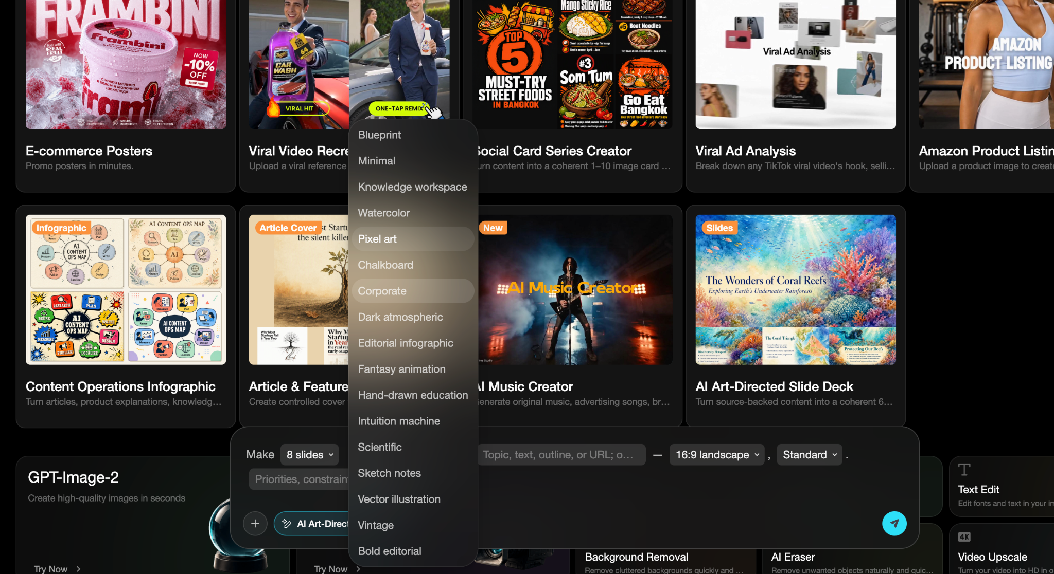
The settings screenshot below comes from the English product UI and is published unmodified. It shows the same four controls used in the case: eight slides, Pixel art, 16:9 landscape, and standard density.
How to turn blog post into slides in six steps
- Choose a source that can support the requested deck.
- Set the count, style, ratio, and density.
- State the wording and claims that must be preserved.
- Review the source-bound outline.
- Generate and inspect each slide image.
- Review the complete sequence before using it elsewhere.
1. Choose a source with enough substance
Start with the article, URL, or pasted text. A good source has a clear promise, several distinct sections, and enough evidence to divide into slide-sized ideas.
The TikTok article worked because it contained a definition, practical recommendations, and a clear progression: hook the viewer, keep the video tight, use captions, create a loop-worthy ending, then review performance data. Those ideas can become separate slides without inventing filler.
What goes wrong: requesting twelve slides from a short paragraph. The slide count doesn’t authorize the system to make up timing, metrics, integrations, or outcomes. Use fewer slides or provide more source material.
2. Set the four visual controls
Choose slide count, style, aspect ratio, and density together. They form one production brief.
For the first case, we chose eight pages, Pixel Art, 16:9, and standard density. The result used dark navy backgrounds, neon accents, chunky pixel typography, and a single visual idea on each page. The full deck felt related without repeating the same composition eight times.
What goes wrong: choosing dense information with a style that needs large decorative elements. The copy and artwork compete for space. Reduce the density or use a calmer visual direction.
3. Record exact wording and boundaries
List any phrase that must appear unchanged. Also state what the slides must not claim.
The Skill builds a per-slide visible-text contract. Each page gets its own approved title and bullets, so copy from slide six doesn’t leak into slide three. Illustration elements remain unlabeled unless their text is explicitly allowed.
What goes wrong: using one deck-wide list of approved words. A global list can’t tell the system which phrase belongs on which page, and repeated copy may appear as decoration.
4. Review the outline before generating images
The outline is where you catch content problems cheaply. Each slide should have one short title, two to four concise bullets, and a visual note describing what the image needs to communicate.
Read the outline against the original source. Does each claim have support? Does the order make sense without a speaker? Can someone understand slide five after seeing slides one through four?
What goes wrong: approving an outline because the headings sound polished. If a claim isn’t in the source, remove it before generation. A beautiful unsupported sentence is still unsupported.
5. Generate and inspect each slide
Generate the raster slides, then inspect the text at full size. Check spelling, missing characters, repeated strings, and copy that wasn’t approved for that page. If a slide is wrong, regenerate it with a corrected prompt.
Don’t repair generated text by painting an HTML, SVG, or canvas overlay on top. That creates a second layout system and hides the failure instead of fixing it.
What goes wrong: judging only the contact sheet. A full-deck view can make a typo look tiny. Open the individual image and read every visible line.
6. Review the complete slide deck
Now zoom out. The deck should carry one idea across the sequence without turning into eight disconnected posters.
Check the opening, the transitions, and the ending. Look for repeated layouts, sudden style changes, and a page that carries far more information than its neighbors. Download the approved images and assemble or publish them in the destination you control.
What goes wrong: assuming the Runtime exports PPTX, merges a PDF, or posts the slides for you. Those tasks remain outside this Skill.
Worked example: one TikTok article became eight slides
The source article covered ways to improve TikTok completion rate. The Pixel Art project turned it into this sequence:
| Slide | Role in the sequence |
|---|---|
| 1 | Introduce the completion-rate topic |
| 2 | Define completion rate and why it affects distribution |
| 3 | Explain the first-three-second hook |
| 4 | Keep videos short and focused |
| 5 | Use captions and on-screen text |
| 6 | Build a loop-worthy ending |
| 7 | Review drop-off data and test changes |
| 8 | Close with the key takeaways |
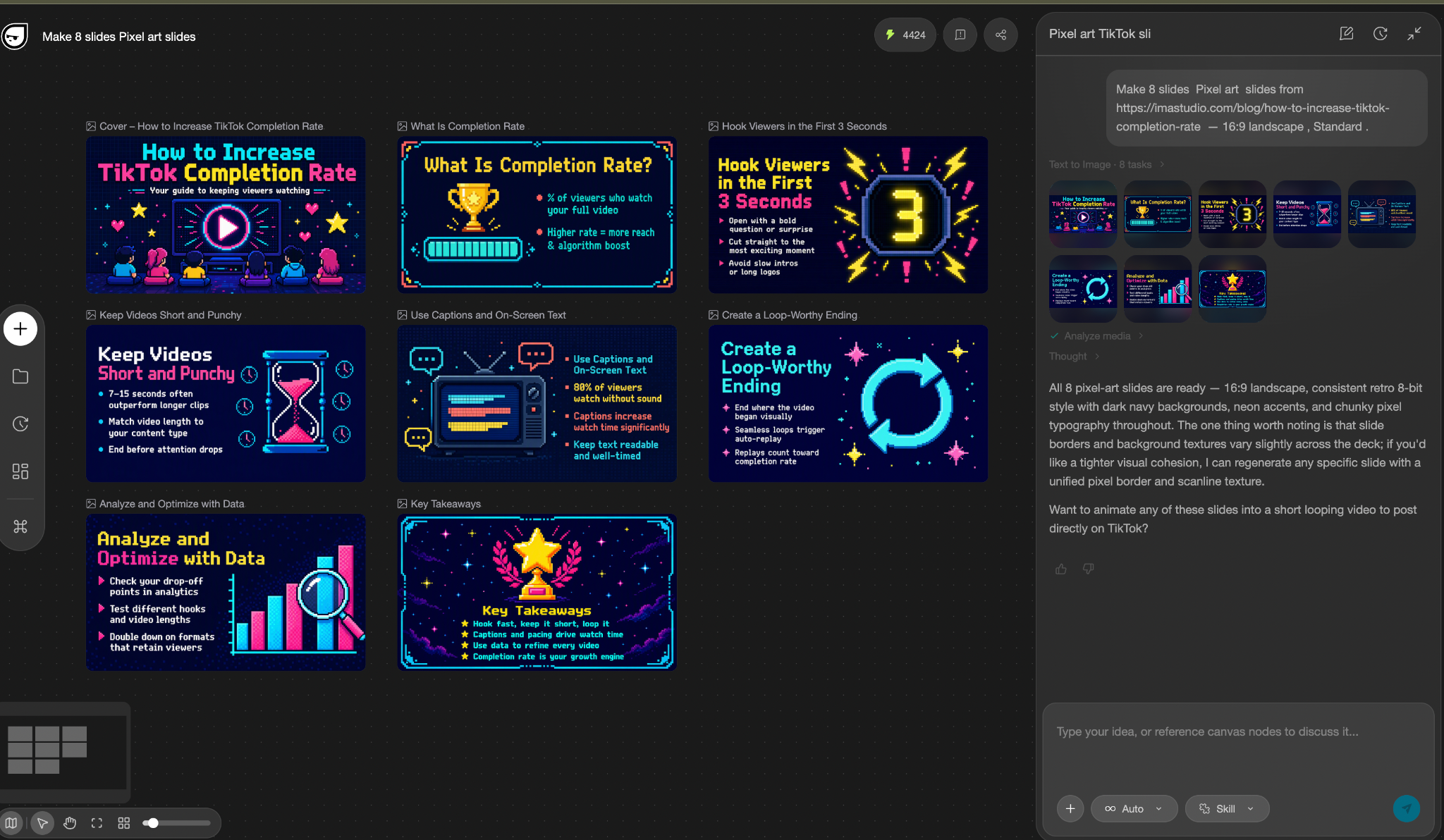
The sequence matters. Slide three doesn’t repeat the definition from slide two. Slide seven changes the visual language from advice to analysis. The final page closes the argument instead of introducing another tactic.


In our two attempts, the operator didn’t find a consistently error-prone step and judged the generated images excellent. That is first-party experience from two projects, not a claim that every source and style will succeed on the first run.
Same source, two visual directions
We ran a second project with Hand-drawn Education. The URL, eight-slide count, 16:9 ratio, and standard density stayed the same. The requested style changed.
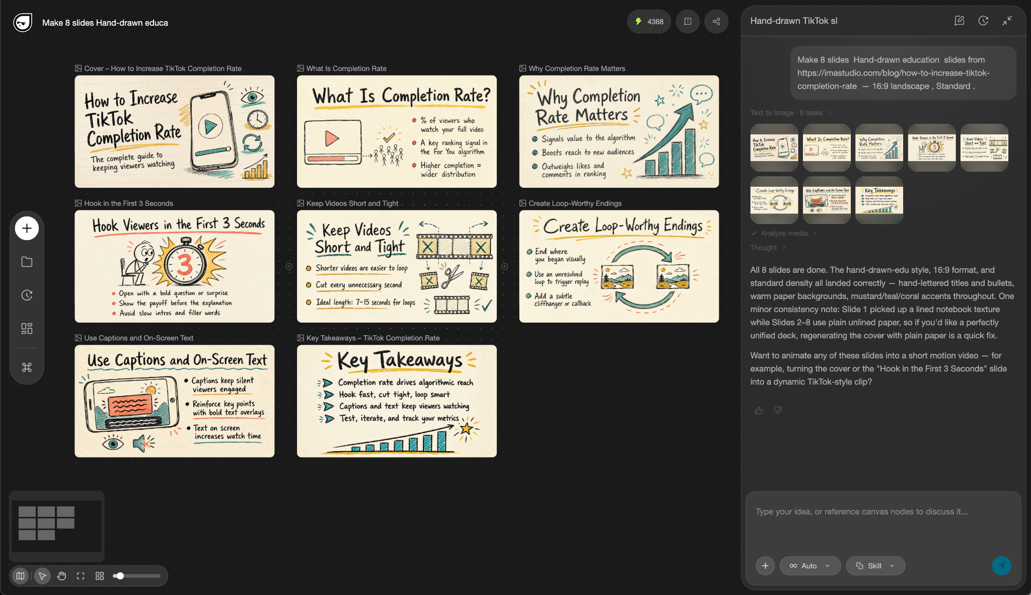
The Hand-drawn Education result used warm paper, handwritten headings, and teal, mustard, and coral accents. It reads like training material or a workshop handout. Pixel Art feels more at home in creator-facing content that needs a stronger visual hook.
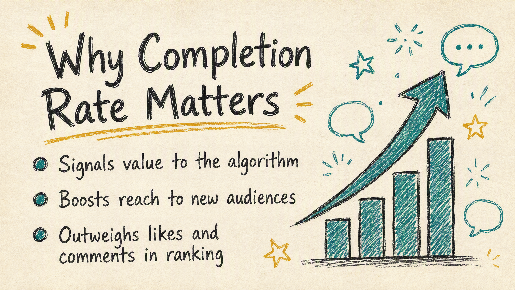
There is one important caveat: the generated outlines also differed. This wasn’t a controlled A/B test where style was the only changed output variable. We can compare the two visual directions, but we can’t claim that one style caused better comprehension, engagement, or completion rate.
How to choose style, ratio, count, and density
Use the reading context to make the decision.
| Intended use | Sensible starting direction | What still needs testing |
|---|---|---|
| Blog embed or desktop knowledge sharing | 16:9, 6–10 slides, standard density | Readability inside the actual article theme |
| Vertical social reading | 9:16, light or standard density | A real vertical result and platform crop |
| Square feed post | 1:1, fewer words per page | Mobile text size and safe margins |
| Internal explainer | 16:9, standard or dense | Whether the audience needs editable charts or speaker notes |
If you need editable charts or speaker notes, stop at the last row and choose a presentation-authoring workflow. Raster slide images are the wrong deliverable for that job.
When not to use this slide deck Skill
The easiest way to misuse a visual Skill is to start with the wrong output shape.
| What you need | Better route |
|---|---|
| One hero image for an article or feature | Use the Article & Feature Cover Creator workflow |
| One structured visual that explains a system or dataset | Use the fact-safe infographic review workflow |
| A platform-native vertical card sequence | Use the Social Card Series workflow |
| Editable PowerPoint, a live speaker deck, PDF assembly, animation, or automatic publishing | Use a presentation-authoring or publishing workflow; this Skill doesn’t provide those outputs |
This routing belongs in the workflow, not in fine print at the end. It saves you from generating good-looking assets that can’t be used for the intended job.
Frequently asked questions
Can I turn a blog post into slides from a URL?
Yes. Supply a public article URL or paste the source text, then choose the slide count, style, ratio, density, and any wording constraints. The source must contain enough information for the requested number of slides.
How many slides can the Skill generate?
The supported range is 6–12 slides. Choose the count based on source depth and reading context. Our verified article case used eight.
Can I edit the result in PowerPoint?
The Skill returns raster slide images, not an editable PPTX. You can place the images into another tool, but the text and layout aren’t native PowerPoint objects.
Can it publish the slides automatically?
No. Download, assembly, export, scheduling, and publishing remain manual or require another verified workflow.
Should I use 16:9 for social media?
Use 16:9 for horizontal embeds and desktop reading. Test 9:16 for vertical social placement and 1:1 for square feeds. Don’t infer vertical quality from a horizontal result.
Turn your next blog post into a slide deck
Bring one source-rich article and decide the output before generation: count, style, ratio, density, and exact wording. Review the outline, inspect each image, then check the sequence as a whole.
Ready to turn a blog post into slides?
About The Author